-
Notifications
You must be signed in to change notification settings - Fork 0
Week 3_3(en): The Box Model
The box model is an important concept to understand how elements are positioned and displayed on a website. Let's learn about the box model!
The main concept of the box model is that all elements on a web page are interpreted by the browser as living inside of a box.
Essentially, a web page is a collection of boxes.
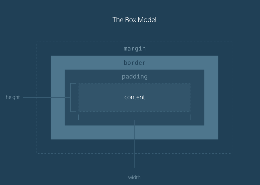
The box model includes the content area's size(width and height) and the element's padding, border, and margin.
 The above image is a visual representation of the box model.
Each of the properties specify the following:
- Width and Height: width and height of the content area
- Padding: amount of space between the content area and the border
- Border: thickness and style of the border surrounding the content area and padding
- Margin: amount of space between the border and the outside edge of the element
The content of an element has 2 dimensions: height and width.
By default, the dimensions of an HTML box are set to hold the raw contents of the box.
The CSS height and width properties can be used to modify these default dimensions.
Let's set the width and height of the .article-body class like below.
.article-body {
  background-color: orange;
  height: 650px;
  width: 700px;
}
The background-color property is added to check the size of the box.
On the browser, you will notice that the height and width have each been set to 650 and 700 pixels.
Pixels allow you to set the exact size of an element's box.
Note: When the width and height of an element are set in pixels, it will be the same size on all devices. (Some elements that are sized according to the size of the laptop screen might overflow a mobile screen.)
Borders are used to draw a line that surrounds an element.
Borders can be specified with the following three properties:
-
width: thickness of border (pixels orthin/medium/thick) -
style: design of the border (includesnone,dotted,solid) See all border styles -
color: color of border (using built-in color keywords, RGB cubic-coordinate system, or HSL cylindrical-coordinate system) Let's add the following declaration to our.article-bodyrule.
border: 3px solid darkorchid;As you can see in the above code, all three properties are set in one line of code, separated by a space.
The default border is medium none color, where color is the current color of the element.
If at least one of the three properties are not set in the CSS file, the default value will be shown.
By setting the border-radius property, we can make the box look more like a rounded box, or even like a circle.
Try adding the following declaration to the .article-body rule.
border-radius: 5px;This will turn all four corners of the border to a radius of 5 pixels. This means the corners will have the same curvature that a circle with radius 5 pixels has.
If you set the radius equal to the height of the box, or to 100%, you can create a border that is a perfect circle.
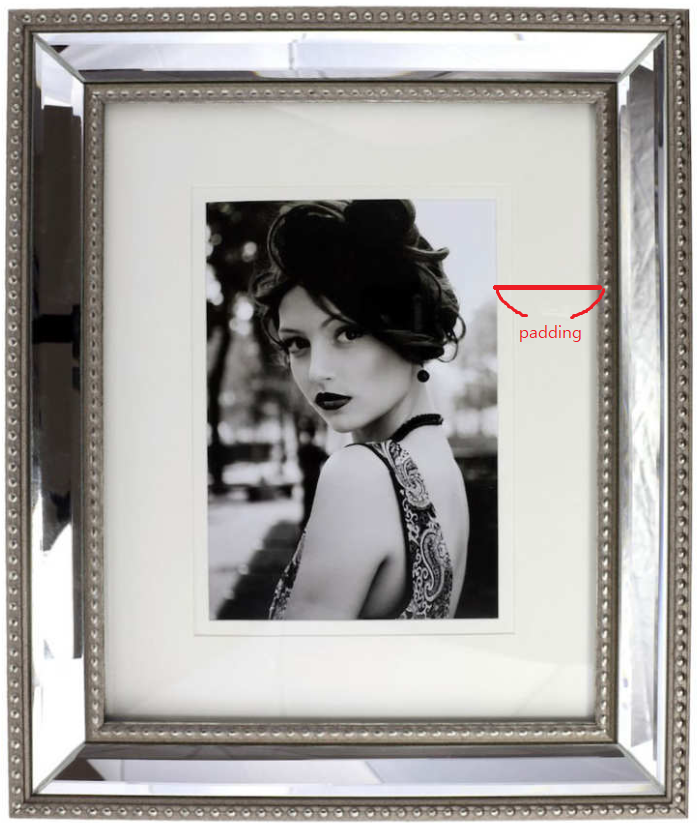
Padding is the space between the content of a box and the orders of a box, just like the space between a picture and the frame surrounding it in the image below.
 Try adding the following declaration to the
 .article-body rule and check the difference on your browser.
padding: 10px;You can be more specific about the amount of padding on each side of a box's content using the following properties.
padding-toppadding-rightpadding-bottompadding-left
There is a more simple way to specify the padding of all four sides.
Instead of writing
padding-top: 6px;
padding-right: 11px;
padding-bottom: 4px;
padding-left: 9px;
you can write it all at once like the following.
padding: 6px 11px 4px 9px;Each of the values correspond to the amount of padding in a clockwise rotation.
When using this method, you must specify a padding value for all 4 sides.
If the top and bottom values are equal, and the left and right values are equal like below,
padding-top: 5px;
padding-right: 10px;
padding-bottom: 5px;
padding-left: 10px;
you can use the following shortcut.
padding: 5px 10px;Margin refers to the space directly outside of the box.
This property is used when you want different boxes to have space between each other.
Try adding the following declaration to your .article-body rule and check it on your browser.
margin: 20px;Just like the padding property, you can be specific about the amount of margin on each side of a box with the following properties:
margin-topmargin-rightmargin-bottommargin-left
It is common to see margin values used for a specific side of an element.
Just like the padding property, margin property has the same shortcuts.
margin: 6px 10px 5px 12px;margin: 5px 10px;Both of the above codes are valid CSS codes.
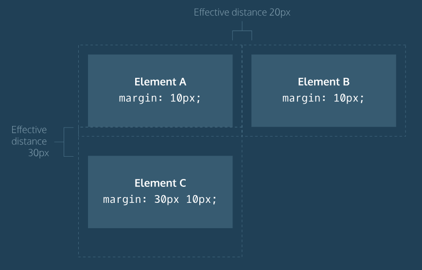
One major difference between padding and margin is that top and bottom margins, also called vertical margins, collapse, while top and bottom padding does not.
 Horizontal margins (left and right) are always displayed and added together.
However, vertical margins do not add.
The larger of the two adjacent vertical margins sets the distance between adjacent elements.
All of the components(width, height, padding, border, margin) add up to comprise an element's size.
But sometimes, these components result in an element that is larger than the parent's containing area.
To ensure that we can view all such elements, we can use the overflow property.
The overflow property controls what happens to content that overflows outside its box.
It can be set to one of the following:
-
hidden: any content that overflows will be hidden from view -
scroll: a scrollbar will be added to the element's box so that the rest of the content can be viewed by scrolling -
visible: the overflow content will be displayed outside the containing element. (default)
For example, if a div's overflow property is set to scroll, all children of this div will display overflowing content with a scroll bar.
Try changing the height and adding a overflow property to the .article-body rule.
height: 300px;
overflow: scroll;Elements can be hidden from view with the visibility property.
The visibility property can be set to one of the following values:
-
hidden: hides an element -
visible: displays an element (default)
Try adding the following declaration to the .article-body rule.
visibility: hidden;You will notice that the contents of the element is hidden but there is still an empty space where the element is intended to be displayed.
(To completely remove the element from the web page, you should use display: none;)