-
Notifications
You must be signed in to change notification settings - Fork 18
DoneButton Widget v7
- status : complete
- version : 7.x

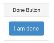
The DoneButton is a customizable button to call for the end of a step.
- id: The id of the button. Default: 'donebutton'.
- button: A reference to an existing HTML button. Default: it creates a new one.
- className: The name of class for the button, or an array of class names. Default: 'btn btn-lg btn-primary'.
- text: The text to display on the button. Default: 'Done'.
- disableOnDisconnect: Disable the button upon disconnection. Default: TRUE.
-
delayOnPlaying: The number of milliseconds to wait before enabling the
button after the
PLAYINGevent is fired (e.g., after a new step begins). Set to zero to enable it immediately. Default: 800.
Whene a new step starts, the step-property donebutton is evaluated:
-
if equal to FALSE, the button is disabled;
-
if string, it is considered the text of the button,
-
if object, it may contain the following options (see above for explanations):
- text,
- enableOnPlaying,
- delayOnPlaying.
Create and append a new DoneButton widget to the header.
var header = W.getHeader();
var doneButton = node.widgets.append('DoneButton', header, {
    text: 'Continue'
});
Change the text of the button at a given step.
stager.extendStep('stepId', {
    donebutton: {
        text: 'I am done'
    },
    // Other step properties follow as needed.
})
Disable the button at a given step.
stager.extendStep('anotherStepId', {
    donebutton: false,
    // Other step properties follow as needed.
})Go back to the wiki Home.
Copyright (C) 2021 Stefano Balietti
Permission is hereby granted, free of charge, to any person obtaining a copy of this software and associated documentation files (the "Software"), to deal in the Software without restriction, including without limitation the rights to use, copy, modify, merge, publish, distribute, sublicense, and/or sell copies of the Software, and to permit persons to whom the Software is furnished to do so, subject to the following conditions:
The above copyright notice and this permission notice shall be included in all copies or substantial portions of the Software.
THE SOFTWARE IS PROVIDED "AS IS", WITHOUT WARRANTY OF ANY KIND, EXPRESS OR IMPLIED, INCLUDING BUT NOT LIMITED TO THE WARRANTIES OF MERCHANTABILITY, FITNESS FOR A PARTICULAR PURPOSE AND NONINFRINGEMENT. IN NO EVENT SHALL THE AUTHORS OR COPYRIGHT HOLDERS BE LIABLE FOR ANY CLAIM, DAMAGES OR OTHER LIABILITY, WHETHER IN AN ACTION OF CONTRACT, TORT OR OTHERWISE, ARISING FROM, OUT OF OR IN CONNECTION WITH THE SOFTWARE OR THE USE OR OTHER DEALINGS IN THE SOFTWARE.