-
Notifications
You must be signed in to change notification settings - Fork 15
between group
Once along-tract data has been compiled for a group of subjects and tracts, either with [[trk_compile_data|trk-compile-data]] or your own alternative, the next step is to fit a statistical model to these observations. Using a plain text data table format similar to trk_data.txt is a good way to go because it can be imported into any stats program. The between_grp.R script, included in the between_group subdirectory within example, is one way that such data could be analyzed using R. Below, we’ll work through it to explain the different parts.
This example uses a small dataset with 11 control individuals, and 9 individuals with fetal alcohol spectrum disorders (FASDs). Tract groups include the left and right (L and R) arcuate fasciculus (AF) and inferior longitudinal fasciculus (ILF). To run this script on the example data, simply change exptDir at the top according to your setup. If the packages listed at the top aren’t already installed, use install.packages() in R to download them onto your system.
The script first loads in a Demographics.txt file, which contains a data table with demographic information about covariates of interest like Age, patient Group, and Gender.
ID	Age	Group	Gender
6CGQP	11	alc	Male
8ET64	13	con	Male
7XT4I	15	alc	Female
GHT8C	9	con	Male
GAK0D	14	con	Male
D43FK	14	alc	Male
LQIMW	15	alc	Male
SUQDJ	18	con	Female
5N29I	15	con	Male
25I87	9	alc	Female
F8KZH	12	con	Female
W1ME9	16	alc	Male
NF6IA	16	con	Male
58DOI	12	alc	Female
OERZD	11	con	Female
JATM7	16	con	Male
H9Q0L	8	con	Female
08E9I	13	con	Female
UWG6L	17	alc	Female
S534C 15 alc MaleThe demographics (Demographics.txt) and streamline information (trk_props_long.txt) are then merged with the main along-tract data table (trk_data.txt). The resulting structure is in a long format, where different levels of the same factor (Hemisphere, Tract, Point) are included as multiple rows for each subject.
> head(trk_data)
     ID Hemisphere Tract Point     FA     SD Streamlines Age   Group Gender Position
1 08E9I          L    AF     1 0.3834 0.1134          28  13 Control Female    0.000
2 08E9I          L    AF     2 0.4143 0.1234          28  13 Control Female    3.125
3 08E9I          L    AF     3 0.4401 0.1075          28  13 Control Female    6.250
4 08E9I          L    AF     4 0.5020 0.0910          28  13 Control Female    9.375
5 08E9I          L    AF     5 0.4393 0.0846          28  13 Control Female   12.500
6 08E9I          L    AF     6 0.4550 0.0926          28  13 Control Female   15.625
...This example uses a serial univariate approach. The same model is applied several times on different subsets of the data corresponding to different tract/hemisphere combinations. For each, the FA in the current tract/hemisphere is the only dependent variable. This is accomplished most generally in R with the function apply and its relatives, and here we use an optimized version for data tables called ddply. Another option for analyzing this type of data would be to take a multivariate approach, where the recorded FA from all the different tracts/hemispheres could be included together as multiple dependent variables.
- Intercept – Is the grand mean FA non-zero? (Obviously yes or there would be no streamlines)
- Point – Does the tract exhibit along-tract variations in FA? (Typically this is true. See Single-subject along-tract atlas)
- Group – Is there an overall offset between groups? (Analogous to the traditional analysis of tract-averaged estimates)
- Point:Group – Do the along-tract variations in FA vary by Group?
> models$anova
   Tract Hemisphere        Term numDF denDF      F.value      p.value
1     AF          L (Intercept)     1   462 4823.5202499 0.000000e+00
2     AF          L       Point    33   462   35.7327075 0.000000e+00
3     AF          L       Group     1    14    2.2165640 1.587149e-01
4     AF          L Point:Group    33   462    0.4862487 9.934023e-01
5     AF          R (Intercept)     1   294 1390.6880038 0.000000e+00
6     AF          R       Point    42   294   13.7965854 0.000000e+00
7     AF          R       Group     1     7    0.1590373 7.019297e-01
8     AF          R Point:Group    42   294    0.3573128 9.999325e-01
9    ILF          L (Intercept)     1   468 3955.1412446 0.000000e+00
10   ILF          L       Point    26   468   53.6638026 0.000000e+00
11   ILF          L       Group     1    18    2.7341481 1.155577e-01
12   ILF          L Point:Group    26   468    2.6003110 3.742813e-05
13   ILF          R (Intercept)     1   522 3757.3678373 0.000000e+00
14   ILF          R       Point    29   522   49.0013197 0.000000e+00
15   ILF          R       Group     1    18    2.2909297 1.474929e-01
16   ILF          R Point:Group    29   522    0.6003668 9.526391e-01
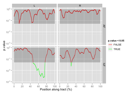
Here we can see that none of the tracts/hemispheres have a significant Group effect, but that the left inferior longitudinal fasciculus (L ILF) has a significant Point:Group interaction. This implies a more focal type of abnormality that may have been missed with the traditional tract-averaged approach.
Because the along-tract data are grouped by subject, we can use a simple mixed-effect model with a random effect term for the subject intercept.
When doing a single statistical test, we can often look to the theoretical distribution of the test statistic to obtain corresponding p-values. However, when conducting many statistical tests jointly, what we typically care about instead is some measure of the overall error rate across all tests. One such measure is the family-wise error rate, which is the chance of committing any Type 1 error across all of the tests. Since there are many simultaneous tests included in an along-tract analysis, relying solely on the original (i.e. uncorrected) p-values will result in an inflated Type 1 family-wise error rate.
To correct for these multiple comparisons, we can use permutation methods to build up a new empiric null distribution of the maximum test statistic across all tests. This can then be used to read off p-values that are corrected for multiple comparisons according to the family-wise error rate. See Nichols and Holmes (2002) PMID 11747097 for an excellent tutorial on using this general approach with neuroimaging data.
Using this example with two groups of 9 and 11 subjects, we can show the theoretical null distribution for a single two-sided two-sample t-test, together with the empiric null distribution of the maximum test statistic across all of the multiple comparisons we are making at the different along-tract locations. Notice how the entire distribution has been shifted to the right, including the red bar indicating the p=0.05 critical value. This is the distribution used to prescribe the FWE-corrected p-values (p.val.adj variable in models$tTable).
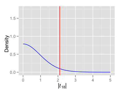

Instead of looking at all of the individual along-tract t-tests immediately (and thus needing to correct for the largest number of multiple comparisons), it can often be advisable to first look to the ANOVA F-test across all of these additional Point:Group terms in the model. Then, only if the F-test is significant, would we go further and look at the individual component t-tests.
When looking at many tracts/hemispheres, it is probably a good idea to also implement some sort of simple multiple comparisons correction at the level of the initial F-tests. For example, if we were originally going to use an alpha threshold of 0.05, but we’re looking at 4 tract/hemisphere combinations, then our modified alpha threshold using the Bonferroni correction should now be 0.05/4 = 0.0125.
The example between-group analysis takes this approach for inference – first looking to the Bonferroni-corrected F-tests, and then using permutation methods to generate corrected p-values for the subset of tracts/hemispheres with significant along-tract effects.
This example script focuses on along-tract group effects (i.e. the t-statistic for the Control – FASD group difference at each location along the tract). However, the same method can be applied to other effects of interest as well; for example, if the model had included Age or Gender terms from the Demographics.txt file.
The example script is only set up to do 100 permutations, but this can be changed by adjusting nPerms at the top of the script. Also included in the between_group directory is a maxT.Rdata file that contains a more complete estimate of the null distribution for these data that was obtained by doing 10000 permutations (displayed above). For doing many permutations like this, it is recommended to use some sort of parallelized method. See the commented section in the script for a hint on how to do this with the multicore package.
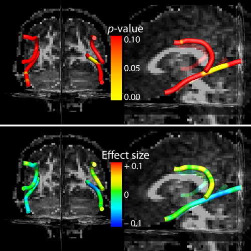
An effects_table.txt file is saved at the end of the script. This contains a table of the along-tract parameter estimates (effect sizes), t statistics, and both uncorrected and corrected p-values. These statistical results will be overlaid onto the mean tract geometry of a representative subject for final visualization back in TrackVis. See [[trk_stats_overlay|trk-stats-overlay]].
> head(models$tTable)
  Tract Hemisphere Point       Value  Std.Error  DF   t.value    p.value p.val.adj Position
1    AF          L     1 0.032670000 0.02668442 447 1.2243099 0.22148020         1    0.000
2    AF          L     2 0.018143333 0.02668442 447 0.6799223 0.49690560         1    3.125
3    AF          L     3 0.007303333 0.02668442 447 0.2736928 0.78444714         1    6.250
4    AF          L     4 0.017273333 0.02668442 447 0.6473190 0.51775777         1    9.375
5    AF          L     5 0.051853333 0.02668442 447 1.9432063 0.05261862         1   12.500
6    AF          L     6 0.039010000 0.02668442 447 1.4619017 0.14447079         1   15.625
...
ggplot2 is a plotting library in R that makes it relatively simple to build up multilayered figures, and also to display mutlivariate data by mapping different dimensions to the standard plot axes (x, y), two extra axes of a subplot matrix, and plotting aesthetics like line width, color, and transparency. This tool is also completely scriptable, which means that whole groups of figures can be automatically updated if a new dataset is acquired (i.e. no time-consuming post-processing in Illustrator). A side effect of this is that research becomes more reproducible, since a full statistical analysis – from raw data to final figures – can be regenerated with the push of a button.
In addition to the official ggplot2 website reference documentation, there is also a ggplot2 book available that is rich with examples. For support/troubleshooting your plotting ideas, there is an active Google Group, as well as a section on StackOverflow. The between_grp.R script also contains a handful of examples that should serve as a pretty comprehensive starting point for the ways that this tool can be effectively applied to the along-tract data. We will discuss these next.
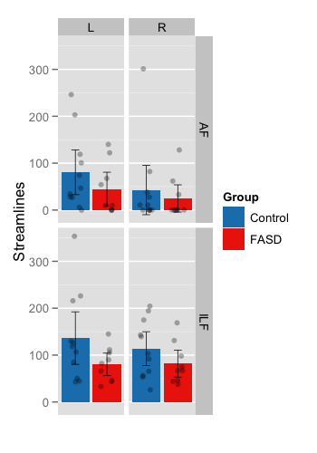
This plot shows the mean number of streamlines for each group. Subplots are facetted within the figure by Tract and Hemisphere. Color is used to encode group.
- Group means – Standard bar plots are used (± pointwise 95% confidence intervals).
-
Individual subjects (
sub_pts) – Shown as transparent circles with slight jitter added to control over-plotting.
This plot shows the mean FA at each collection of vertices along the tract. Subplots are again facetted within the figure by Tract and Hemisphere. Color is used to encode Group, and line width is used to encode the number of streamlines.
- Individual subjects – The along-tract variation in FA for individual subjects is displayed in the background. Transparency and a slight x-axis jitter have been added to control over-plotting.
-
Group means (
means_smooth) – Overlaid on top are locally-weighted smooth estimates of the two group means (± a simple pointwise 95% confidence band). -
Tract-averaged group differences (
grp_effect) – If there is a significant overall offset between groups (i.e. the Group F-test is significant), indicating a shifting of the entire curve up/down, then an asterisk will be placed in the corner of the subplot. -
Along-tract group differences (
sig_bars) – If there is a significant Point:Group interaction term, then a bar at the bottom will be placed to indicate which component t-tests are significant.
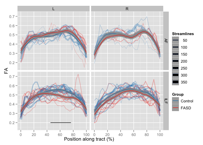
In addition to overlaying the statistical output onto the 3D mean tract geometry of a representative subject (see TrackVis rendering, above), it can also be useful to show these results as 2D plots. With ggplot2 this can be done by modifying the same basic plot style we used to show the along-tract variation in FA:

Back to Wiki Home