Visualizations
All visualizations generated in MOG are interactive and the charts and graphs can be manipulated and customized in many ways.
Line charts allow multiple features to be plotted together across all the samples on an X-Y plane. They visualize trends in data across the samples, and make it easy to compare one feature to another. (For example, what are the expression patterns of multiple members of a gene family. Which ones are up-regulated in particular samples. What are their relative levels of expression across the samples.)
To create a line chart:
-

Select rows to plot from the "Feature metadata" pane. E.g., to get a set of desired genes do a statistical analysis so genes highly correlated to your gene of interest will be at the top of the chart, make a custom list, or filter based on a characteristic of interest.
Note: Selecting too many rows will slow down the performance of MOG for big datasets. E.g., don't try to plot hundreds or thousands of genes at once. -

CLICK Plot-->Selected Rows-->Line Chart from the menubar at the top of the "Feature metadata" pane. -

A new window containing the line chart appears with:
- A display area containing the line chart plot.
- A toolbar to manipulate the line chart (top of window).
- A status bar that displays status of selected points in the chart (bottom of window).
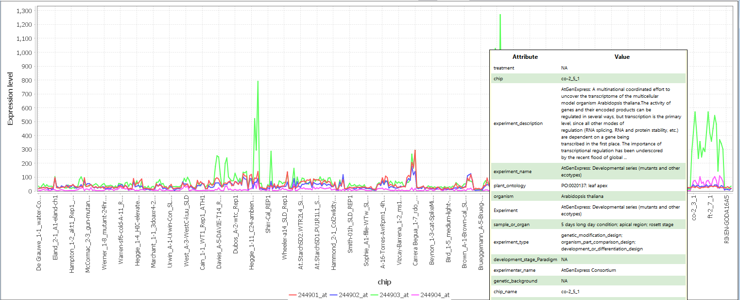
Figure 14: line Chart Display Area
The X-axis represents the samples and the Y-axis represents the value of each feature. Each line is a series of connected points that represents an individual feature and its changes in value across all samples. At the bottom is a legend showing the color of line that represent each feature. SELECT AN AREA holding left-CLICK to zoom the line chart to that area. HOVER a mouse over data points to reveal the metadata associated with that sample. CLICK the mouse on a data point to show the metadata for that sample in the "Sample MetaData tree" (Figure 14). DOUBLE-CLICK the mouse on a line to open a window to change the color of that gene/feature.
The line chart toolbar (Figure 15) lets a user customize, interact with, and export the chart.

Figure 15: line Chart Toolbar.
Toolbar components are:
-
 Set properties: Opens a new dialog box to change chart background color, fonts, and axis labels.
 -
 Export: Exports the chart as a .png file. Note The user can enter dimensions of image to determine resolution (e.g. for publication)
 -
 Print: Opens a dialog box to print chart.
 -
 +Zoom: Zooms in both axes.
 -
 -Zoom: Zooms out both axes.
 -
 Reset Zoom: Fits the entire chart in the display area
 -
 Data points: Toggles visible data points.
 -
 Legend: Toggle visible legend.
 -
 Clears any markers in the chart see 7.1.4
-
 Metadata: Displays the metadata from the "Sample Metadata Tree" pane, for selected sample.
 -
 Sort/group. Pull-down menu contains many options for sorting and grouping the chart.
 -
 Interactively select and save chart data to .png file.
 -
 Adjust slider to change lengths of x-axis labels.
 - Change X-Axis labels: Lists metadata headers and replaces X-Axis label with user-selected header.
-
 Color: Choose a new color scheme for all series.
 -
 Line thickness: Adjust this spinner to alter line thickness.
 - Annotation: Write a custom annotation on the chart.

Figure 16: Line Chart Status Bar.
The line chart status bar (bottom of chart) displays information about the selected data point in the chart:
- Series: Shows which feature is currently selected and its key metadata.
- External web apps: CLICK to search external websites using the name of a selected series.
- Column: Shows the sample name for the selected point.
- Y-value: Shows the y value of the selected point.
- Mark: CLICK to annotated a selected data point with X and Y axis information.
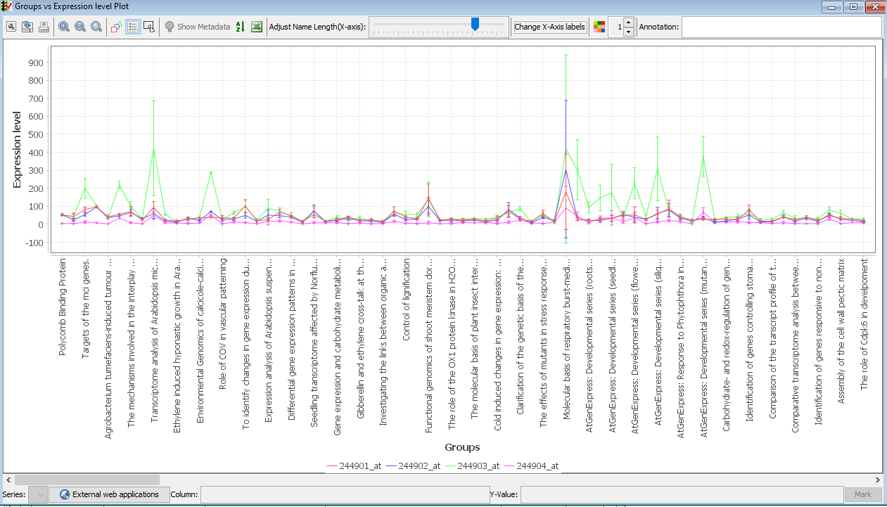
Lets the user explore the data by quickly reordering it and grouping it in different ways (see Figure 17)

Figure 17: Group line chart by metadata.
- Default: Sorts the x-axis by the order of the samples in the .mog file.
- Sample Name: Sorts the x-axis alphabetically by the unique identifiers of the samples.
- X-axis labels: Sorts the x-axis by the current x-axis labels. X-axis labels can be changed through the line chart toolbar of the line chart toolbar
- Expression level: Sorts the x-axis by the decreasing order of the series selected from the pull-down menu.
- Group by Metadata: Groups the chart by categories in the metadata. CLICK the Sort/group button in the line chart toolbar to open the menu and choose "Group by Metadata". Different categories may be combined to get multiple groupings by selecting the "More..." option (see Figure 17).
Note: each time a grouping operation is performed, the groups in the chart are displayed using markers. The markers remain in the chart unless cleared by the user using the line chart toolbar or another grouping is chosen. - Group by Query: Groups the samples by selected metadata. CLICK to open the search panel and create a metadata query for grouping.
- Custom: Groups samples according to user specifications. Custom sorts can be saved for future analyses of the dataset.
A line chart with averaged replicates is a line chart in which the data of replicates is averaged the data before plotting. Section 5.1 describes how to specify a factor for replicates in the sample metadata.
To create a line chart with averaged replicates:
-

In the "Feature metadata" pane, select rows to plot. Note: Selecting too many rows may slow down the performance of MOG. -

In the menubar located at the top in the "Feature metadata" pane, CLICK Plot -->Selected Rows -->Line Chart with Averaged Replicates. Choose "default grouping" to average the samples under the default metadata header. To choose a different grouping, CLICK "Choose grouping". -
A line chart with means +- standard deviations of each value for each feature is displayed.
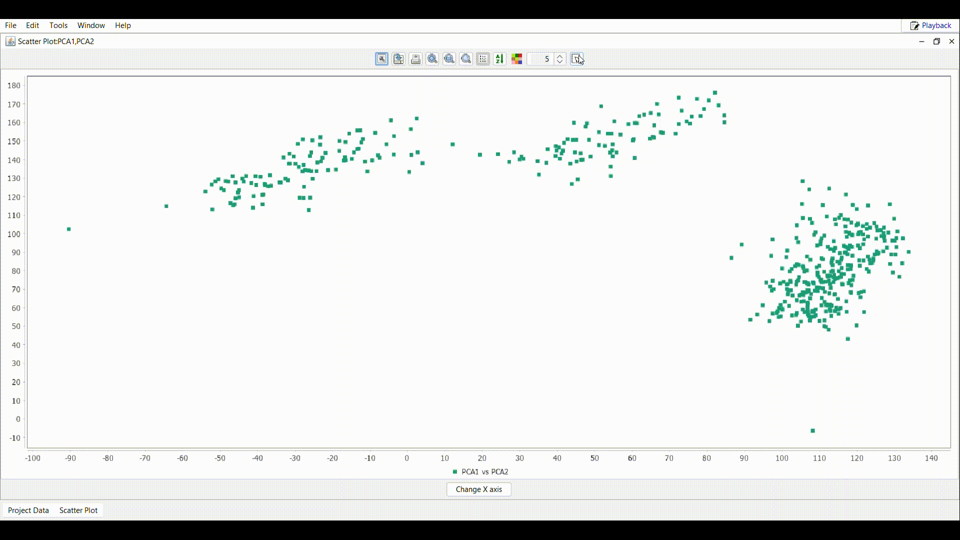
A scatter plot visualizes data as the values for one feature in a each of a set of samples v.s. the value for another feature across the same samples. It can reveal relationships between the features. MOG can plot multiple features (pairwise) in a scatter plot.
To create a scatter plot with selected features, perform the following steps:
-
In the "Feature metadata" pane, select rows to plot. Note: Selecting hundreds of rows will slow down the performance of MOG. -
In the menubar at the top of the "Feature metadata" pane , CLICK Plot -->Selected Rows --->Scatter Plot. -
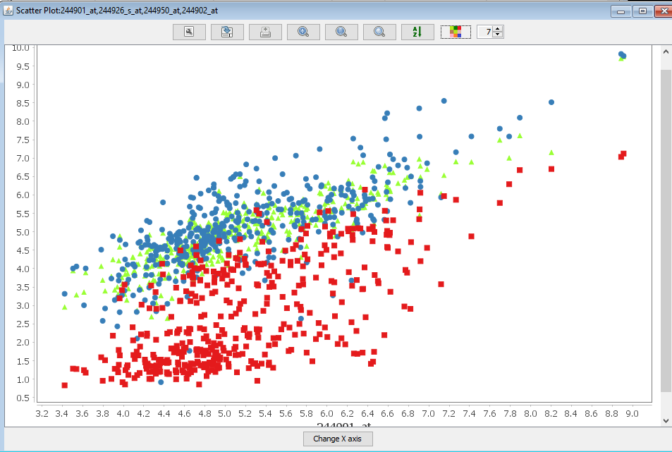
A new frame containing the scatter plot is displayed. Each color in the scatter plot compares the values for a different pair of features. In this example, the features are genes. The red dots compare the expression values of gene ATMG00640 (X-axis) and gene ATMG00520 (Y-axis) in each sample. The blue dots compare the values of gene ATMG00640 (X-axis) and gene ATMG00650 (Y-axis). The toolbar of the scatter plot is similar to that of the line chart thus a user can interact with the data and metadata in multiple ways.
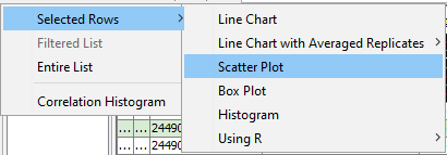
In the scatter plot frame tool bar, select the tool, to display the below selection menu
.
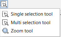
Activates the single selection tool, sample lists can be created or exported by performing the following steps:
-
 Draw a rectangle as shown in the gif over the interested region in the plot.
 - In the table attached to the scatter plot, all the samples inside the rectangle are imported. Use the File menu to perform the desired operation.
Activates the multi selection tool, to draw multiple rectangle over many interested regions, the selected regions can be created as sample lists or exported by performing the following steps:
-
 Draw multiple rectangles as shown in the gif over many interested regions in the plot.
Note: If multiple rectangles are intersected, the samples in the intersection regions are added only once.
Draw multiple rectangles as shown in the gif over many interested regions in the plot.
Note: If multiple rectangles are intersected, the samples in the intersection regions are added only once. - In the table attached to the scatter plot, all the samples inside the rectangle are imported. Use the File menu to perform the desired operation.
Activates the default zoom tool. This will remove the selected samples panel attached to the scatter plot panel.
Once the samples are selected, the File menu can be used to export the samples to a text file/excel file (xlsx) or create a sample list for further processing.
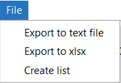
- Export to text file: Save the sample lists in the table to a text file.
- Export to xlsx: Save the sample lists in the table to an excel file (xlsx).
- Create list: Create a sample list, that can be further used for filtering.
A box plot helps understand the distribution of the data. MOG can plot multiple box plots side-by-side, for direct comparisons.
To create a box plot:
-
In the "Feature metadata" pane , select rows to plot the in the chart. Note Selecting too many rows may slow down the performance of MOG. -
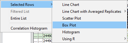
In the menubar located at the top in the "Feature metadata" pane, CLICK Plot -->Selected Rows -->Box Plot. -

A box plot is displayed in a new frame. The toolbar of box plots is similar to that of line chart.
The histograms visualize the distribution of values in a dataset for selected feature(s). MOG can plot histograms for multiple features side-by-side, which facilitates a direct comparison.
To create a histogram:
-
In the "Feature metadata" pane, select the rows to the plot. Note Selecting too many rows may slow down the performance of MOG. -

In the menubar at the top in the "Feature metadata" pane, CLICK Plot -->Selected Rows-->Histogram. -

A histogram is displayed in a new window. In the histogram shown, four genes were selected for plotting. Each color represents the distribution of a particular gene. Bin size was 100 samples. The green gene has a broader distribution and is more highly expressed. Although four genes are plotted, the values for one gene (pink) are obscured. CLICKing on that particular gene will bring its values to the forefront.
The toolbar of the histogram plot is similar to that of the line chart. The number of bins the data points are grouped in can be changed by CLICKing the button at the bottom of the window.

Figure 18: An example volcano plot generated using MOG
The volcano plot is a scatterplot that visualizes the statistical significance (P-value) that two features are differentially expressed (on the Y-axis) versus the fold-change between the two features (on the X-axis) (see Figure 18). The user can select which sets of samples to compare (e.g., all leaf samples versus all root samples). Section Differential Expression Analysis describes how to calculate differential expression (DEA) in MOG .
A correlation histogram visualizes the distribution of correlation values across a given set of samples(see Correlations Between Feature). MOG shows the number of correlations of a given correlation value for pairwise comparisons of user-selected features.
To plot a correlation histogram:
-
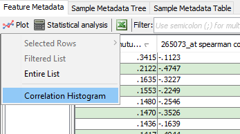
In the menubar located at the top in the "Feature metadata" pane, CLICK Plot --> Correlation Histogram and choose the column containing correlations to be plotted. -

A correlation histogram plot is displayed in a new window. This correlation histogram shows the distribution of pairwise Spearman correlation values for a user-selected gene compared to all other genes. Bin size is 10.
A heat map visualizes the gene expressions across a given set of samples. The color intensity in the heat map represents the changes in expression values.
To plot a heat map:
-
In the "Feature metadata" pane , select rows to plot the in the chart. Note Selecting too many rows may slow down the performance of MOG. -

In the menubar located at the top in the "Feature metadata" pane, CLICK Plot -->Selected Rows -->HeatMap. -
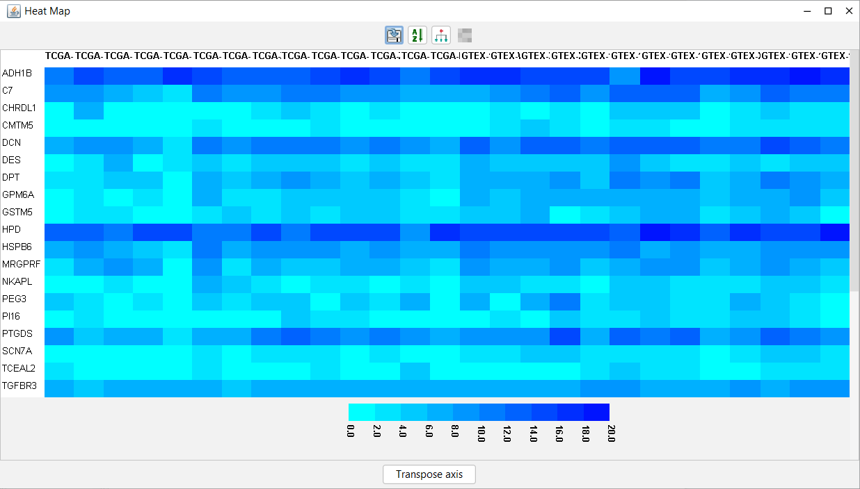
A heat map is displayed in a new window. The features are on the rows and the samples are on the columns. The toolbar of the heat map contains tools to enable a user to interact with the data and metadata in multiple ways