-
Notifications
You must be signed in to change notification settings - Fork 4
r scripting charts scatter
Sebastian edited this page Jan 28, 2018
·
4 revisions
To use a scatter chart you have to import the according classes via:
import(at.gmi.djamei.viz.charts.gral.ScatterChart)A scatter chart has the following parameter options
| Name | Type |
|---|---|
| data | A Matrix of data points, (x,y) value pairs per row |
| groups | A Factor listing the group association of the rows in the data matrix |
| colors | A character vector containing the color values to be used for the different groups |
| legend | A character vector representing the text which should be shown in the legend for the corresponding group |
| labels | A character vector representing the labels of the individual points |
| showLabels | A logic value which determines whether labels should be displayed or not |
| lineMarkers | A matrix with 5 columns (x1,y1,x2,y2,color), defining lines that should be drawn between the points (x1,y1) and (x2,y2) with the given color (hex string, e.g.:#FF0000) |
| xLabel | The label for the X axis |
| yLabel | The label for the Y axis |
| title | The title of the plot |
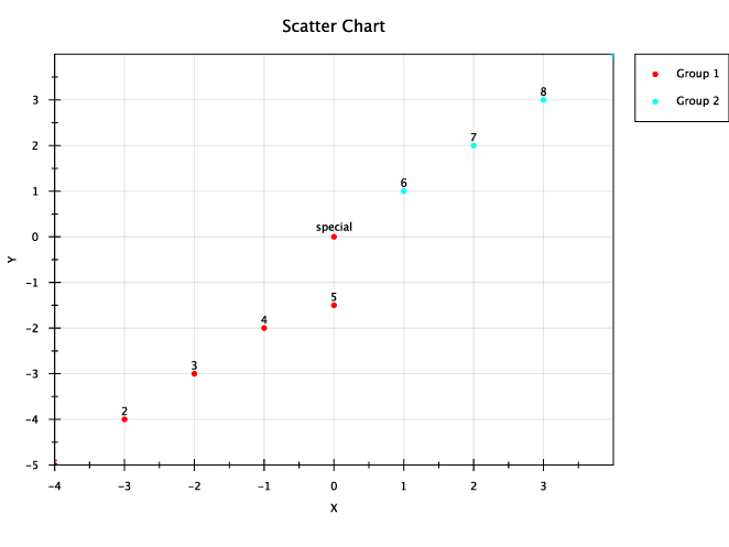
data <- cbind(c(-4,-3,-2,-1,0,0,1,2,3,4),c(-5,-4,-3,-2,-1.5,0,1,2,3,4))
colors=rainbow(2)
scatter <- ScatterChart$new(data = data,
    groups=as.factor(c("G1","G1","G1","G1","G1","G1","G2","G2","G2","G2")),
    colors = colors,
    legend=c("Group 1", "Group 2"),
    labels=c('1','2','3','4','5','special','6','7','8','9'),
    showLabels=T,
    xLabel = "X",
    yLabel = "Y",
    title = "Scatter Chart"
)
phenopipe_add_chart(scatter)