-
Notifications
You must be signed in to change notification settings - Fork 2
tutorial2
This is the second part of the VLDocking Tutorial for Java Swing applications.
In this second lesson, you will learn how to modifiy the contents and the behaviour of the containers of your dockable components.
This lesson assumes you have read the two first parts of the tutorial and that you are now familiar with the concepts of :
- a Dockable.
- the
DockingDesktop -
SingleDockableContainerandTabbedDockableContainer - and how to layout your components into their desktop
If you don't feel enough confident about those concepts, please read again the previous lessons.
The DockKey object provides a unique key to identify a Dockable during the loading/saving
process via its dockName key property.
You have also learned from the previous lesson that the DockKey was the object used to
customize the DockableContainer of a Dockable.
Let's see how it works.
If you have looked at the Javadoc of the DockKey class, you already know that
a DockKey is a specialized class following the JavaBean pattern.
You can access a set of properties like name, tooltip,
isCloseEnabled and so on, with getters and setters.
You can also attach a java.beans.PropertyListener to be notified when a property
is updated.
This is exactly what the Framework does and how it dynamically follows key updates.
Now, we can have a look at the different categories of properties :
- Visual properties
- Behaviour properties
Note : keep in mind that SingleDockableContainer and TabbedDockableContainer are
interfaces : you can choose to use different implementations than the default one, with visual
settings that could be different from those described below.
Default visual properties are listed here :
| Property | Type | Effect |
|---|---|---|
| name | String | The label displayed on the title bar |
| tooltip | String | The tooltip associated to the title bar |
| icon | 16x16 pixels Icon | The icon used by the title bar (there is no default icon : if set to null, no icon will be drawn) |
The following code will add a title, a tooltip and and icon to the MyTextEditor component.
    class MyTextEditor extends JPanel implements Dockable {

        DockKey key = new DockKey("textEditor");

        JTextArea textArea = new JTextArea("A Text Area");

        public MyTextEditor() {
            setLayout(new BorderLayout());
            JScrollPane jsp = new JScrollPane(textArea);
            jsp.setPreferredSize(new Dimension(200, 400));
            add(jsp, BorderLayout.CENTER);

            key.setName("The Text Area");
            key.setTooltip("This is the text area tooltip");
            key.setIcon(new ImageIcon(getClass().getResource("document16.gif")));
        }

        public DockKey getDockKey() {
            return key;
        }

        public Component getComponent() {
            return this;
        }
    }
And here is a screenshot of the result :

Changes are propagated dynamically, you can for example replace an icon by another to reflect a change in the component (a good example is to have an "updated" version of a document icon showing that the document has been updated and needs to be saved).
Visual properties, unlike Behaviour properties, are thread-safe : they can be changed on any application thread.
The following boolean properties have and effect on the operations allowed (and managed) by the DockingDesktop.
| Property | Effect |
|---|---|
| isCloseEnabled | The dockable can be closed (removed from the desktop).
if false, the "close" button will be removed from the title bar |
| isAutoHideEnabled | The dockable can be iconified
if false, the "hide" button will be removed from the title bar |
| isMaximizeEnabled | The dockable can be maximized (full size of the desktop)
if false, the "maximize" button will be removed from the title bar |
| isFloatingEnabled | The dockable can be detached from the desktop and displayed in its own palette window (default value is *false*) |
The following code will disable the close and auto-hide features of our MyTextEditor component :
    class MyTextEditor extends JPanel implements Dockable {

        DockKey key = new DockKey("textEditor");

        JTextArea textArea = new JTextArea("A Text Area");

        public MyTextEditor() {
            setLayout(new BorderLayout());
            JScrollPane jsp = new JScrollPane(textArea);
            jsp.setPreferredSize(new Dimension(200, 400));
            add(jsp, BorderLayout.CENTER);

            key.setName("The Text Area");
            key.setToolTip("This is the text area tooltip");
            key.setIcon(new ImageIcon(getClass().getResource("textArea16.gif")));

            // turn off autohide and close features
            key.setCloseEnabled(false);
            key.setAutoHideEnabled(false);
        }

        public DockKey getDockKey() {
            return key;
        }

        public Component getComponent() {
            return this;
        }
    }
The following screenshot will show you the effects or this code, you can verify that the close and autohide buttons have been removed from the text area's title bar.

Changes are, as for visual properties, propagated dynamically.
But, as they might affect the AWT hierarchy they should not be considered thread-safe :
Once the DockingDesktop is realized (visible on screen),
you should restrict the change to the Event Dispatch Thread (the thread used
by AWT/Swing to deliver UI events).
Until now, you have learned how to split or createTab dockables,
but there wasn't any indication of their size requirements.
To understand how resizing works, you must know first a little bit more about DockingDesktop internals.
The DockingDesktop displays its dockable containers (remember the two kinds : Single/Tabbed-DockableContainer)
inside a specialized container : the DockingPanel.
This DockingPanel (one instance per DockingDesktop) can be recursively subdivided in two
when a Dockable is added with the split method. The container realizing the
split is a subclass of JSplitPane named com.vlsolutions.swing.docking.SplitContainer.
SplitContainer has and enhanced look and feel and a better resizing behaviour.
You never access these internal SplitContainers, the main reason beeing that they are the current layout implementation, and that another layout manager could be used in a future version to replace them (and thus would remove the need of nesting of containers).
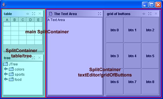
The following diagram shows how the SplitContainer hierarchy associated to our example.

This can be done at any time, you just have to use the two dedicated methods of
DockingDesktop :
-
setDockableWidth(Dockable dockable, double width)to adjust the width of a dockable -
setDockableHeight(Dockable dockable, double height)to adjust the height of a dockable
Those methods have two arguments :
-
a
Dockable, contained in aSingleDockableContaineror aTabbedDockableContainer. -
a
doublevalue, between 0 and 1, indicating the proportion of the dockable container into its parentSplitContainer.
Important : remember that the proportional width or height is relative to a splitcontainer, which
can be smaller than the DockingDesktop, especially when many dockables are shown.
It's still possible, the resizing will not occur on this parent SplitContainer,
but on the first ancestor encountered with a VERTICAL orientation.
Of course, it's the same rule for changing the width of a dockable contained
in a VERTICALLY oriented SplitContainer.
This shoud be evident : as our Desktop is divided in SplitContainers, changing the width or height of a dockable will also change the opposite component.
And, as SplitContainers can be nested, the effect will be propagated to the nesting hierarchy.
Example : if you have a row of dockables, changing the height of one of them will be propagated to the others.
The DockKey object has also a setResizeWeight(float weight) affecting its
resizeWeight property. Valid values range from 0.0f (do not resize) to 1.0f (be the most resized).
Resizing weight is used when the DockingDesktop (usually through its parent window) is made bigger or smaller. This resizing affects the internal layout and the following rules are applied to select the dockable which will be resized :
- The resizeWeight is propagated into the splitting hierarchy, giving a maximum resize weight to both parts of a SplitContainer
- when both resizeWeights are 0, the resizing is shared by both sides
- when a resizeWeight is 0 and the other is positive, then that side takes all the resizing
- when both resizeWeights are positive, a ratio is computed and the splits resized accordingly.
For example, when creating a multiple document application (like a web browser with tabbed browing and some utility dockable around), you can set the resizeWeight of the documents to 1, and the other weights to 0. In that case, the utility dockables will remain unchanged when resizing the window, and only the documents will grow or shrink.
Grouping is a feature that helps you to control which dockable can be included in the same tabbed container.
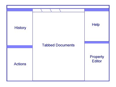
For example, when creating a MTDI (multiple tabbed document interface), you want to have the following configuration :

A Multiple Tabbed Document Interface
And, of course, you don't want to have the "property editor" tabbed in the sames tabbed container than the one of your "Documents", but you would also prefer to let the user group the 4 helper dockables in the same tab if he wants so.
To do this, you just have to declare two DockGroups :
- The "documents" group
- The "helper dockables" group
Then, you will add this information to your DockKeys as in the follwing example :
    DockGroup documentsGroup = new DockGroup("documents");
    DockGroup helperGroup = new DockGroup("helper dockables");

    // set the documentsGroup to all "documents" DockKeys
    DockKey documentKey1 = new DockKey("document_1", "Document 1");
    DockKey documentKey2 = new DockKey("document_2", "Document 2");
    documentKey1.setDockGroup(documentGroup);
    documentKey2.setDockGroup(documentGroup);

    // set the helperGroup to all other DockKeys
    DockKey propertyEditorKey = ...
    propertyEditorKey.setDockGroup(helperGroup);
    DockKey historyKey = ...
    historyKey.setDockGroup(helperGroup);
    ...
Easy isn't it ?
Note : this feature is more complex than that : you can create hierarchies of DockGroups to allow certain combinations of dockables (for example, if you want to have two or three sets on non-mixable documents). You can have more information in the DockGroup's javadoc.
Another interesting feature of VLDocking is the customization of title bars and tabs.
With that feature, you will be able for example to add a "close all documents" pop-up menu to your tabbed documents, or some specific menus ("save", "save as...", "cvs...").
To do that, you will have to register a special class to your DockKeys using :
the public void setActioncustomizer(DockableActionCustomizer actionCustomizer).
The DockableActionCustomizer is an abstract class you will have to inherit from in order to add custom menus.
Here is an example of such a customizer :
    // get predefined closeAll and closeAllOther actions from helper class
    Action closeAllInTab = TabbedContainerActions.createCloseAllAction(dockable, desk);

    Action closeAllOtherInTab = TabbedContainerActions.createCloseAllOtherAction(dockable, desk);

    // create an action customizer
    DockableActionCustomizer customizer = new DockableActionCustomizer(){
         public void visitSingleDockableTitleBarPopUp(JPopupMenu popUpMenu, Dockable dockable){
             // this is for title bars
             popUpMenu.add(new JMenuItem("test"));
         }

         public void visitTabSelectorPopUp(JPopupMenu popUpMenu, Dockable dockable){
             // and this is for tabs...
             popUpMenu.add(new JMenuItem(closeAllInTab));
             popUpMenu.add(new JMenuItem(closeAllOtherInTab));
         }
    };

    // activate the title bar and tabs features
    customizer.setSingleDockableTitleBarPopUpCustomizer(true);
    customizer.setTabSelectorPopUpCustomizer(true);

    // register to a DockKey
    dockable.getDockKey().setActionCustomizer(customizer);
From now on, whenever a right click will occur on the title bar of the dockable, a "test" pop-up menu will appear (added at the end of the system-wide actions of the pop-up menu).
And when this dockable will be added to a TabbedDockableContainer, a right click on its tab will show the "close all documents" and "close all other documents" menu entries.
Note : The visitXXX methods may be called many times (the current implementation does not cache the pop-up menu : it is created and discarded for a specific right mouse click). So it is wise not to declare listeners from inside these methods, or to perform long tasks as they may affect the behaviour (or memory usage) of your application.