-
Notifications
You must be signed in to change notification settings - Fork 11
Getting Started
This tutorial will get you started with Vizier by creating a simple demonstration notebook. It assumes that you have installed Vizier Desktop already.
Launch Vizier from the command line
$> vizierVizier usually takes a few seconds to start up. Also, the first time you launch Vizier, it will take a minute or two to download supplemental files that it needs to run. This will only happen the very first time you run it (and possibly after upgrades). Eventually you should see something like the following printed out:
Starting server...
... server running at < http://localhost:5050/ >
Opening your browser... (disable with '-n')
If Vizier doesn't automatically open your web browser, open your favorite web browser and navigate to http://localhost:5050/.
**Note: ** If you are on Windows and using WSL2, you may need a workaround. See the windows install instructions.
Open the URL you see in your favorite web browser (Vizier gets tested on Chrome and Firefox, if you have problems with any other browser, report it so we can fix it). If everything worked, you should see the following.
Click the (+) to create a new project and name it "Deer Ticks". You should see a screen like the one below.
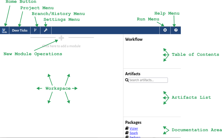
Let's get acquainted with the Vizier interface. In the top bar are several menus:
- The Home Button will take you back to the Vizier main menu.
- The Project Menu shows you the name of the current project, and lets you rename or export the project so that someone else can import it..
- The Branch/History Menu lets you control Vizier's versioning system, going back to older versions of the notebook or creating parallel branches. If you've used GIT, you should feel right at home. If not, don't worry, we'll get back to this menu later in the tutorial.
- The Settings Menu lets you customize Vizier and manage integrations (e.g., with mapping services, Python, and other systems).
- The Run Menu shows you the current notebook status (the square indicates that it's currently stopped), and lets you pause execution or freeze/thaw the cells of the notebook (more on this later).
- The Help Menu takes you to this Vizier wiki.
On the right of the screen are three summary views, two of which are currently empty:
- The Table of Contents shows a list of all 'modules' (or 'cells') in the project.
- The Artifacts List shows a list of the state of your notebook, including all variables, datasets, and other artifacts.
- The Documentation Area provides links to documentation.
The central area is the workspace. This is where your workflow lives. In between each module, you'll see a separator (like the one at the top) that you can use to add new modules. A special shortcut (pencil and paper) will let you quickly add a markdown documentation cell.
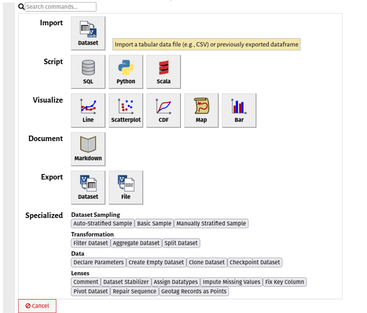
Notebooks are made of modules, each representing one step in a larger workflow. If you've used other notebooks like Jupyter, these should be familiar. One major difference in Vizier is that there are many different types of cells or "modules", for you to choose from. Once you have finished this tutorial we recommend you to read the Vizier overview which goes a bit more into detail about the GUI elements that allow you to manipulate cells. To see what we mean, click the (+) symbol:
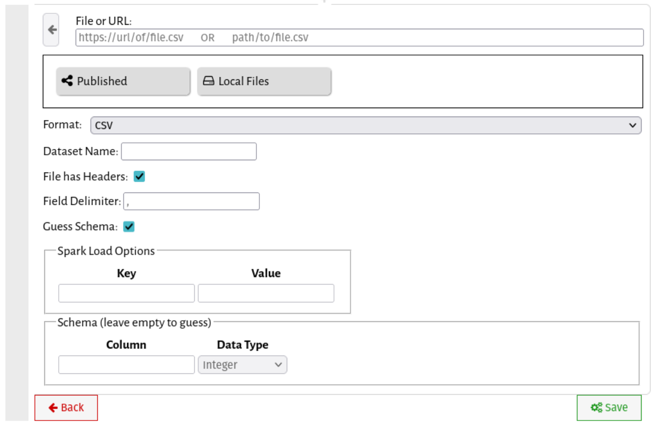
Go ahead and click Import: Dataset. You should see a screen like this.
Just like Jupyter, you can use regular old Python or Scala to get data into Vizier, but Load Dataset cells make things easier. Let's start with the interface.
- At the top, you can provide a URL or file path explicitly. File paths are local to the directory from which you're running
vizier. - Just below the URL bar is a file browser. Local Files lets you explore files in the current directory visually, and Published lets you explore datasets published from other workflows.
- Below that are the import settings, including the name of the dataset, and any format-specific settings.
- Spark Load options will accept any spark load option as a key-value pair.
- Finally, the schema lets you manually specify the schema of the file to be loaded (or leave it blank to guess).
For now, we're going to load a dataset from the NYS Open Data Portal. For this example, we'll be using the 2019 Deer Tick Surveilance Dataset. The NYS open data portal provides a convenient CSV download link:
https://health.data.ny.gov/api/views/kibp-u2ip/rows.csv?accessType=DOWNLOAD
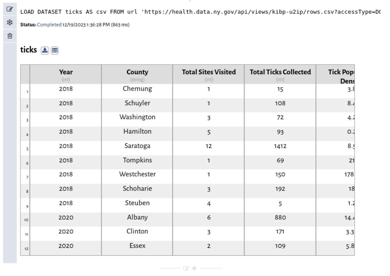
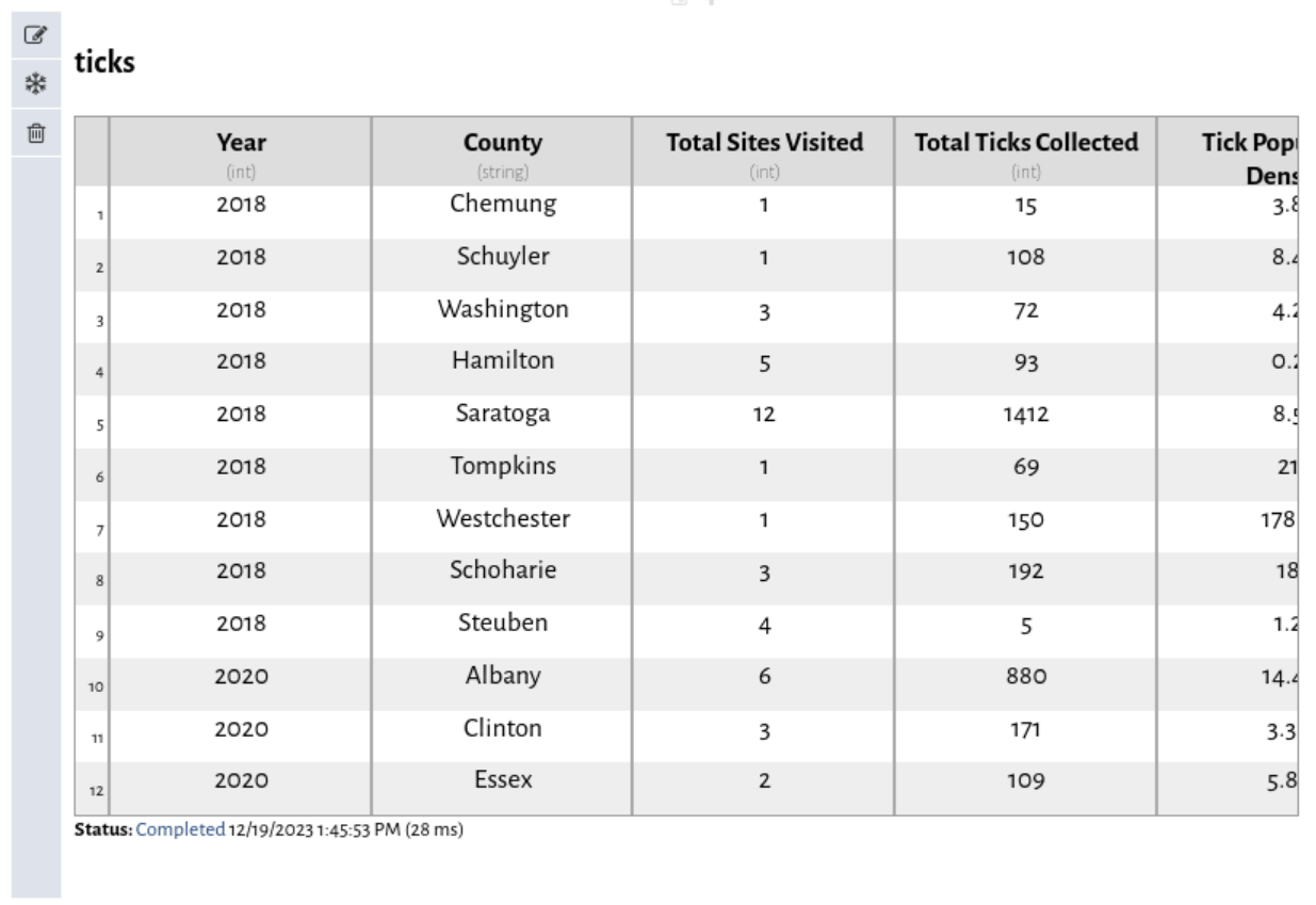
Copy this link, paste it into the URL field, Select the csv format, and name the dataset 'ticks'. Finally click the green save button at the bottom-right of the cell. You can leave all of the other options as-is. Vizier will take a moment to download the file, and you should see it show up below the load dataset cell.
Three things just happened:
- Vizier downloaded the file directly from the URL.
- Vizier analyzed the CSV file and figured out the column names (from the header row) and the column types (integer, real, string) from the data.
- Vizier made the file available as a dataset named
ticks
The point-and-click Load Dataset interface collapsed and was replaced by the results of running the cell: In this case, the table that was just loaded. You can always get back to the point and click interface by clicking on the cell. You'll also see a small status summary, which should now say "Completed", and then give the date/time, and time spent running the cell.
Note the three buttons to the left of the cell:
- Edit: While most cells let you click on the results area to edit the cell, you can always click this to edit the cell.
- Freeze: This opens up the freeze menu, which will let you 'freeze' this cell, or this cell and every cell below it. More on frozen cells later.
- Trash: Click this and then the checkmark to delete the cell.
Also note the two buttons over the dataset view:
- Download: Click this to save a copy of the dataset as a csv file.
- Spreadsheet: Click this to add a spreadsheet cell after this cell in the workflow.
Finally, note two changes to the sidebar on the right:
- A new workflow step appears in the table of contents: Load ticks
- A new dataset artifact named
ticksappears in the artifact list. The buttons next to it show:- Warnings: Click this to view any warnings associated with this datset
- Spreadsheet: Click this to add a spreadsheet cell after this cell in the workflow.
- Download: Click this to save a copy of the dataset as a csv file.
- View: Click this to jump to the cell that created the dataset.
Different artifact types allow different operations, but this should give you a sense of what is possible.
Vizier lets you edit data inline. To see how this works, Click the spreadsheet button. (It doesn't matter if you use the one above the dataset, or the one in the artifact list). You'll see a new cell added to the list. Initially, this cell looks just like the dataset above, with no differences.
However, a spreadsheet cell is editable. Click in any cell.
This is Vizier's spreadsheet view. In addition to viewing the data here, you can also edit it. We're going to be working with the B_BURGDORFERI column, and you might note that this column is missing some values. That's because these values are given as a percentage of the TOTAL_TESTED column, and on those rows there's a 0 in TOTAL_TESTED. That makes sense for the dataset, but we want to treat those values as being 0s. Go ahead and replace a bunch of the missing B_BURGDORFERI values with 0s and hit the green save button.
Changes that you make in the spreadsheet will be reflected in the ticks dataset.
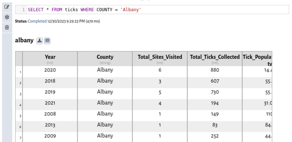
Another way you can interact with data is through SQL. If you aren't familiar with SQL, there's a great tutorial here. It's great for bulk data transformations. For example, we can filter the dataset down to just data for Albany with a SQL cell. Click the + button to create a new SQL Query cell then add the following SQL
SELECT * FROM ticks WHERE COUNTY = 'Albany'name the output dataset albany and hit the green submit button.
Vizier will think for a bit and you'll have a new dataset called albany. You can take a look at that through the result tab. You can find out more in the SQL Cell Documentation.
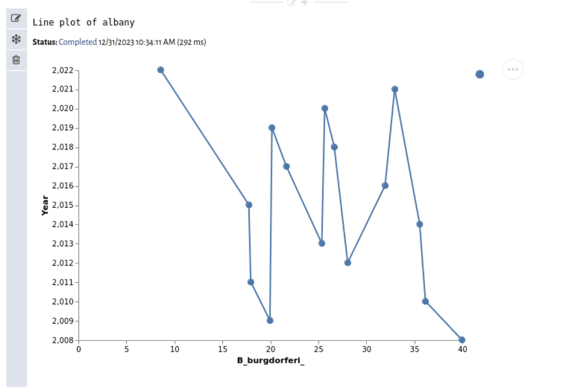
Let's see how B_BURGDORFERI rates have changed over time. Click the + button and create a new Line Plot cell.
Select the albany dataset, pick YEAR as the X-axis, and pick B_BURGDORFERI as the Y-axis. Then hit the green save button. As a shortcut, you can always click control-enter while editing any cell to run it instead.
Note the button with three dots in the upper-right hand corner. Vizier's plot cells rely on Vega. You can use that pop-up menu to download the raw Vega plot specification, export the plot as a PNG, or open up the Vega editor to customize your plot.
You can find out more in the Plot Cell Documentation.
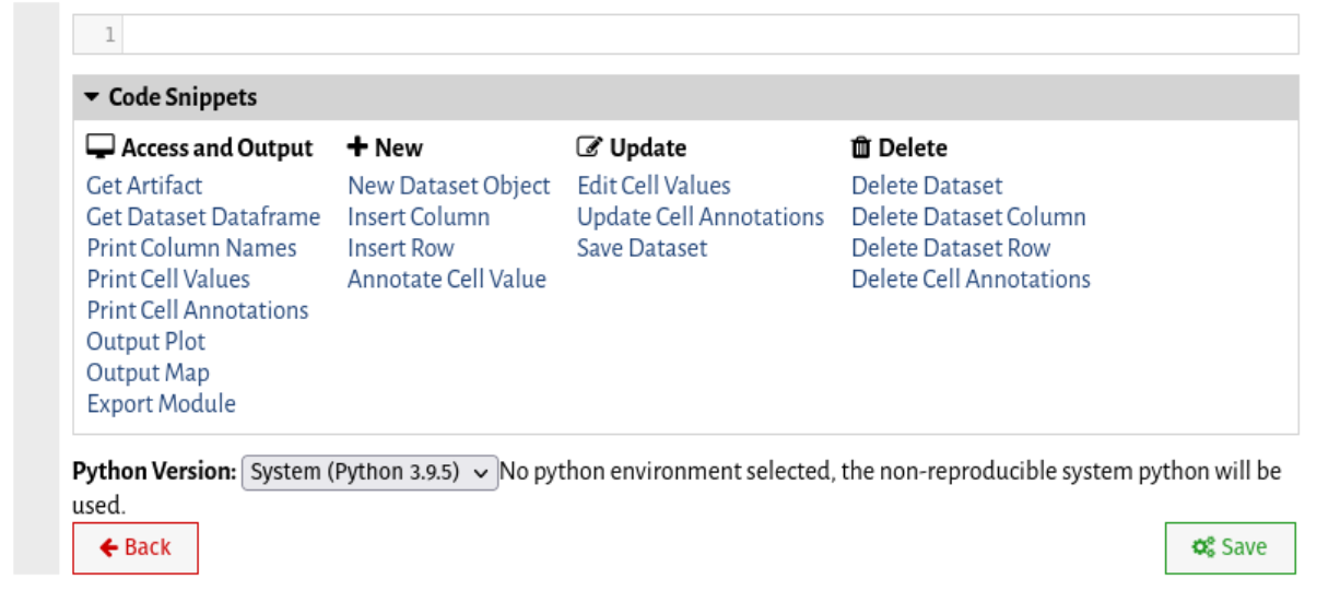
Sometimes you need more than just a simple line plot or histogram. For this, we can use Python cells. Vizier Desktop uses your system's Python version, so any libraries you've already installed (e.g., using Pip) will be available. For creating plots, Vizier integrates the Bokeh visualization library. Click the + button and create a new Python Script cell
Vizier pre-loads the vizierdb module, which lets you interact with Vizier datasets. Click the Code Snippets dropdown and a list of examples of how you can use the vizierdb module will appear. Click any example to append the appropriate code snippet to your cell.
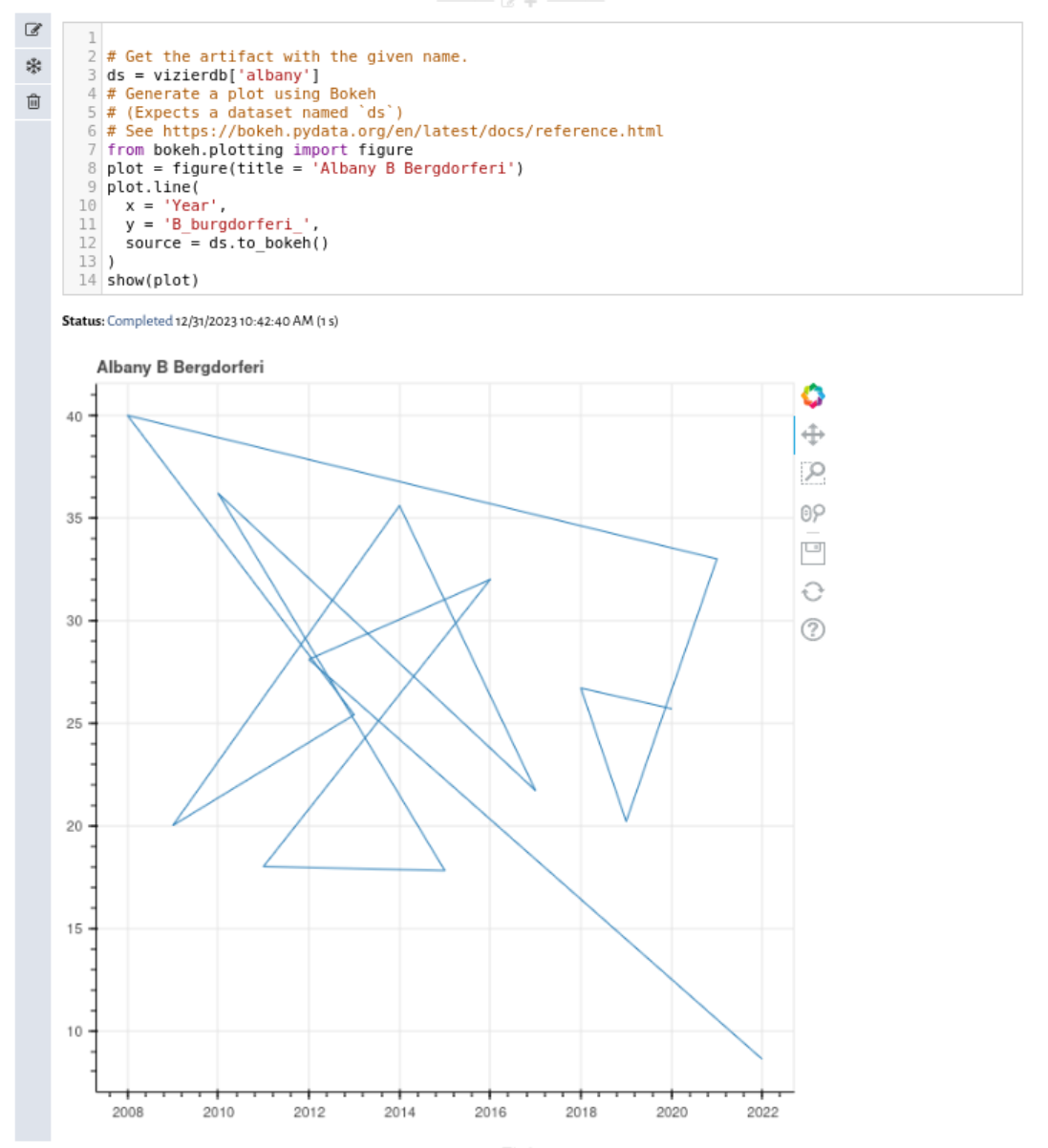
Let's start by re-creating the Albany B. Burgdorferi plot. Click Get Dataset and then Output Plot (Bokeh). In the resulting code template, replace...
- ...
ARTIFACT-NAMEon line 2 withalbany - ...
MY_FIGUREon line 9 withAlbany B Bergdorferi - ...
X-COLUMN-NAMEon line 11 withYEAR - ...
Y-COLUMN-NAMEon line 12 withB_BURGDORFERI_Click the green submit button and you'll see the same plot you saw before but visualized through Bokeh. Bokeh plots are interactive. You can pan and zoom, or save the current view using the toolbar to the right of the plot. Let's take a quick look at the anatomy of this script. - On line 2,
ds = vizierdb.get_dataset('albany')gets us a copy of the dataset. - On line 9,
figureis a Bokeh command that creates a figure. This function can takes a number of parameters including the plot's title, x/y axis labels, and other general configuration options. - On line 13,
ds.to_bokehis a function on Vizier datasets that transforms the dataset into a Bokeh-friendly format. The entire dataset is converted, although be aware that for Bokeh, column names are case-sensitive. - On line 10, the
plot.linefunction draws the line. - Finally, on line 15, the
showfunction actually displays the plot. Bokeh is pre-configured by Vizier to output directly into the notebook.
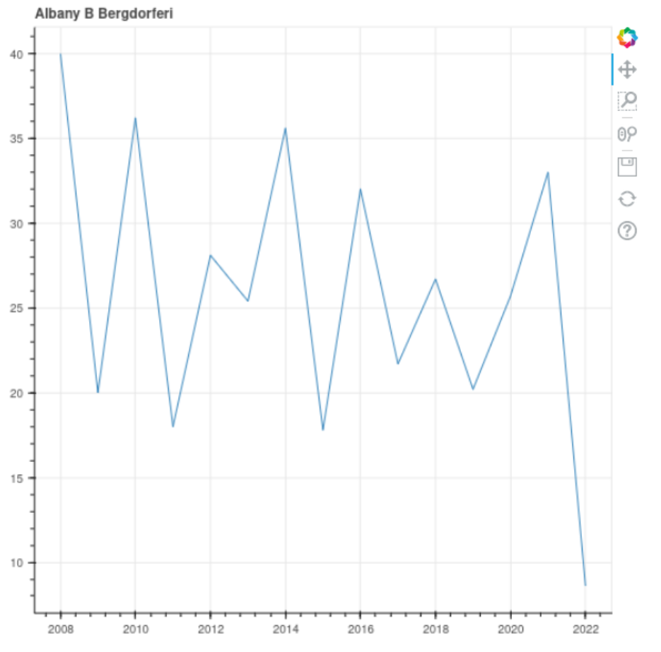
Oooops! The line is all cluttered up! Everything is out of order. The dataset downloads out of order. Let's fix that by modifying our SQL query to produce its output in sorted order. Go to the SQL cell and add ORDER BY year at the end. The resulting SQL command should be:
SELECT * FROM ticks WHERE COUNTY = 'Albany'
ORDER BY year
Hit the green save button. Now go back to the Python cell. The plot should be in order now! This is one of Vizier's most powerful features. Vizier keeps track of which artifacts (variables) each cell uses. If a change you make updates an artifact earlier in the notebook, Vizier re-runs the cell. That way, your notebook is always in-order.
If there's ever a reason you don't want a cell to run, you can use the freeze cell feature to the left of any cell or in the Run menu to temporarily "freeze" the cell. The cell will still appear in the notebook, but Vizier will ignore it as if you had deleted it.
Hopefully you've gotten a taste of Vizier's capabilities. To learn more, have a look at the Vizier documentation.

