-
Notifications
You must be signed in to change notification settings - Fork 11
Cell Plot
Most plotting commands use Vega. You will be able to download or edit the resulting vega chart by using the (...) button in the upper right.
On all Vizier-generated plots, you can mouse-over any point to see all values from the row that defined the point.
Vizier includes several commands for plotting data:
- Line
- Scatterplot
- CDF
- Bar
- Map
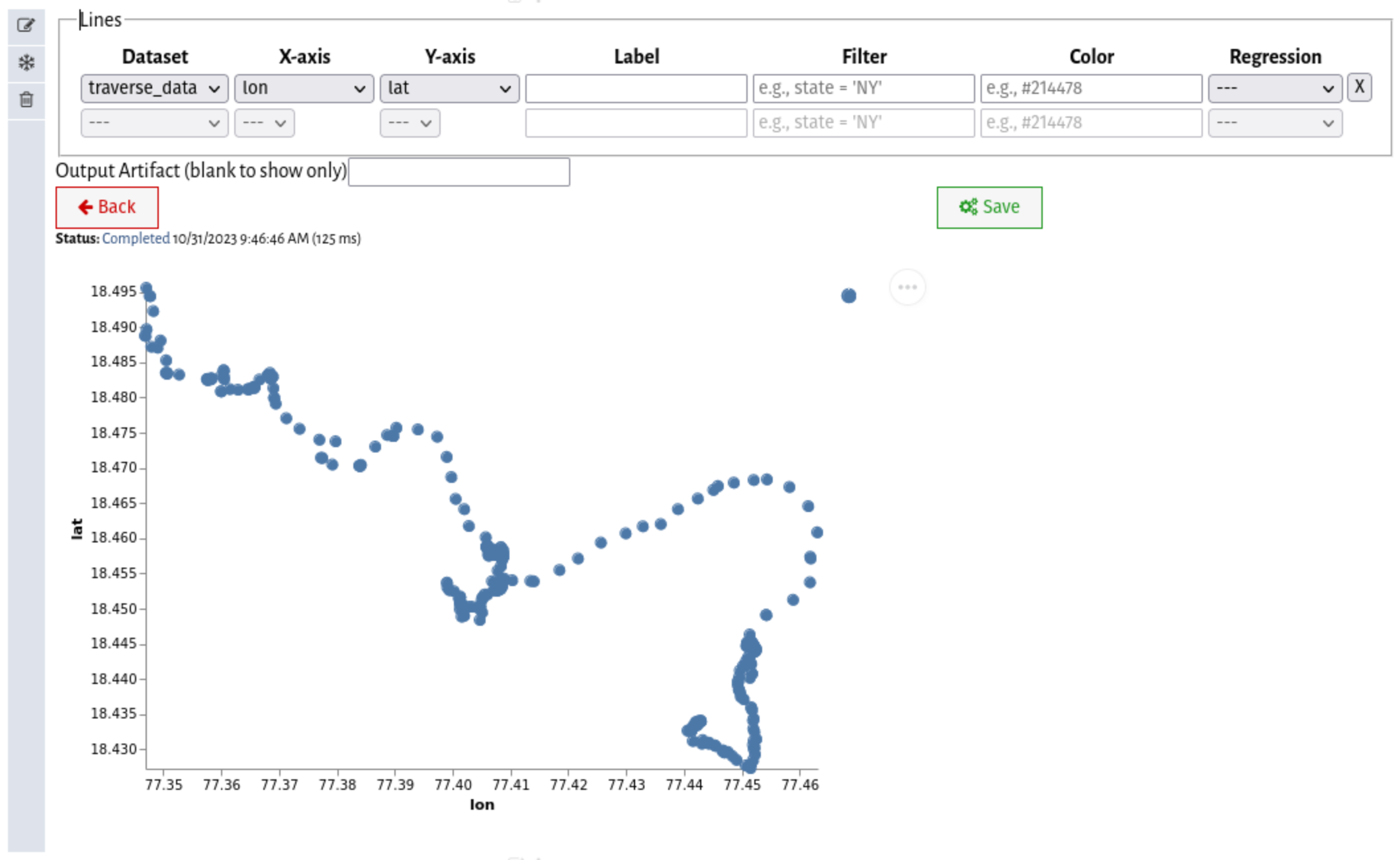
Draw one or more lines on a shared axis. Each 'row' in the cell represents one line.
Line charts are typically used for samples taken from a continuous stream of data (e.g., temperature readings).
- Dataset: The dataset to read from
- X-axis: The column to use as an x-axis (must be numeric); The dataset will be sorted on the x-axis before display
- Y-axis: The column to use as a y-axis (must be numeric)
- Label: A string to use as a label, or empty to auto-select
- Filter: See Filters below
- Color: An HTML color to use for the axis
Arrange points on a shared axis. Each 'row' in the cell defines a separate color.
Scatter plots are used to plot data where there is no point 'between' any two other points. For example, the relationship of student scores on one test to overall grades.
- Dataset: The dataset to read from
- X-axis: The column to use as an x-axis (must be numeric)
- Y-axis: The column to use as a y-axis (must be numeric)
- Label: A string to use as a label, or empty to auto-select
- Filter: See Filters below
- Color: An HTML color to use for the axis
- Regression Type: Optionally select a regression type to add a trend-line.
Draw the cumulative distribution function for one or more datasets on a shared axis. Each 'row' in the cell defines a separate curve.
CDFs are used to quickly visualize the distribution of an attribute in a dataset without resorting to binning.
- Dataset: The dataset to read from
- X-axis: The column to compute the CDF overs (must be numeric)
- Label: A string to use as a label, or empty to auto-select
- Filter: See Filters below
- Color: An HTML color to use for the axis
Draw a grouped bar plot. Each 'row' in the cell defines a different inner group/color.
Bar charts are used to compare aggregate statistics.
- Dataset: The dataset to read from
- X-axis: The column to use to define the 'outer' group of the bar (must be categorical)
- Y-axis: The value to use (must be numeric); If multiple rows are assigned to the same group, they will be summed
- Label: A string to use as a label, or empty to auto-select
- Filter: See Filters below
- Color: An HTML color to use for the axis
Plot points on a map (powered by OpenStreetMap). Each 'row' in the chart defines one GIS layer.
Map charts are used to show geospatial data.
- Dataset: The dataset to read from
- Layer Name: A string to use as a label for the layer.
- Layer Type: Whether the layer is a vector or raster layer.
- Feature Column: The column that identifies the feature (Must be a Sedona Raster or Vector attribute)
Most plot commands allow data to be pre-filtered before display. Vizier supports any valid SparkSQL boolean expression. Examples include:
-
city = 'Buffalo': Include only rows where the attributecityhas the valueBuffalo -
___ AND ___: Include only rows where both of the listed conditions apply. -
city LIKE '%, NY': Include only rows where the attributecityends in, NY -
___ OR ___: Include only rows where at least one of the listed conditions applies.

