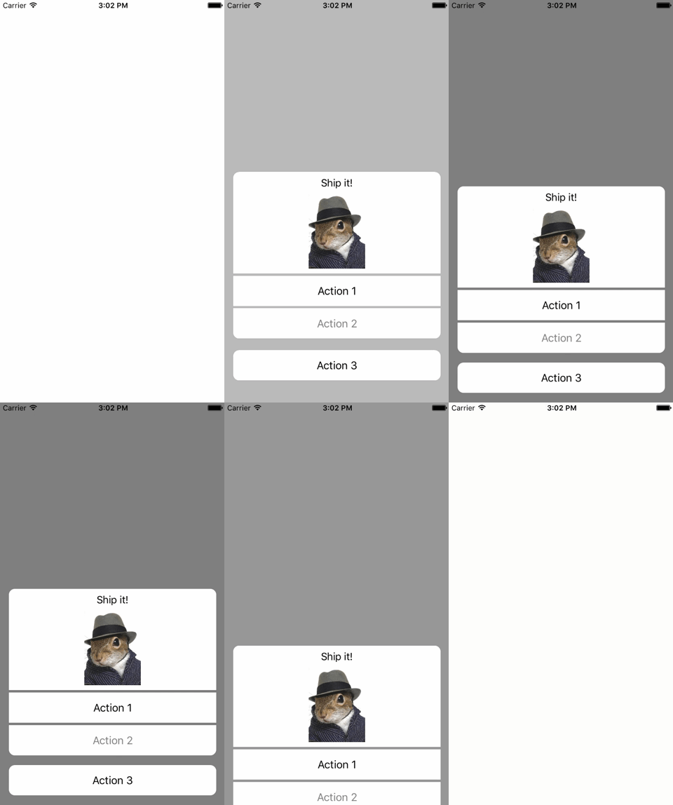
AFMActionSheet provides a AFMActionSheetController that can be used in places where one would use a UIAlertController, but a customized apperance or custom presentation/dismissal animation is needed. Seeing as how AFMActionSheetController was inspired by UIAlertController, it too supports ActionSheet and Alert styles to make your life even easier.
To create an action sheet with default style and default transition animations:
let actionSheet = AFMActionSheetController()
let action = AFMAction(title: "Action", enabled: true, handler: { (action: AFMAction) -> Void in
    // Do something in handler
}
actionSheet.addAction(action)
self.presentViewController(actionSheet, animated: true, completion: {
    // Do something after completion
})
That's it.
AFMActionSheetController supports two styles: the default action sheet style and alert style. These are set via initializers with ControllertStyle enum (ControllertStyle.ActionSheet and ControllertStyle.Alert accordingly)
let actionSheet = AFMActionSheetController(style: .ActionSheet)
let alert = AFMActionSheetController(style: .Alert)To change presentation and dismissal animations, implement a UIViewControllerTransitioningDelegate and pass it to AFMActionSheetController
let actionSheet = AFMActionSheetController(transitioningDelegate: myCustomTransitioningDelegate)or
actionSheet.setupTranstioningDelegate(myCustomTransitioningDelegate)Action sheet's controls are created by adding AFMAction objects to the controller
actionSheet.addAction(action)It is also possible to add actions as "Cancel actions". When using ControllertStyle.ActionSheet style, controls for these actions will be displayed in the bottom "Cancel section".
actionSheet.addCancelAction(action)To use custom views as action controls just pass the view with action to addAction or addCancelAction method
actionSheet.addAction(action, control: myCustomControl)
actionSheet.addCancelAction(action, control: myCustomControl)
Height of the action control is whatever height passed custom view specifies, but it is possible to specify minimal control height with minControlHeight property.
Title view is a view that is located on top of the action sheet and works similar to action controls. To set the title view with custom view
actionSheet.addTitleView(myCustomTitleView)or to set a default UILabel with a text
actionSheet.addTitle("Title")Like with action control height, it is possible to specify minimal control height with minTitleHeight property.
There is a number of properties to help further modify the look and behavior of action sheet controller:
spacing: Intspecifies content's spacing between action controls (default is4)horizontalMargin: Intspecifies spacing from content to controller's top and bottom (default is16)verticalMargin: Intspecifies spacing from content to controller's left and right (default is16)cornerRadius: Intspecifies corner radius of content (default is10)backgroundColor: UIColorspecifies controller's background color (default isblackColor().colorWithAlphaComponent(0.5))spacingColor: UIColorspecifies content's spacing color (default is.clearColor())outsideGestureShouldDismiss: Boolspecifies whether the click on background outside of controls and title dismisses action sheet (default istrue)
To run the example project, clone the repo, and run pod install from the Example directory first.
iOS 8 and up.
AFMActionSheet is available through CocoaPods. To install it, simply add the following line to your Podfile:
pod "AFMActionSheet"Ilya Alesker, [email protected]
AFMActionSheet is available under the MIT license. See the LICENSE file for more info.


