2.1.0
Eto.Forms v2.1 builds on the 2.0 release providing many bug fixes, more consistent behaviour across platforms for many controls, and also tons of new features and controls.
Since 2.0, there have been 453 commits and 51 resolved issues.
Visual Studio & Xamarin Studio Addins
TL;DR: Get started with the VS or XS/MD addins here.
There are now F# and VB project and file templates to get you started quicker and easier than ever with your favorite language.
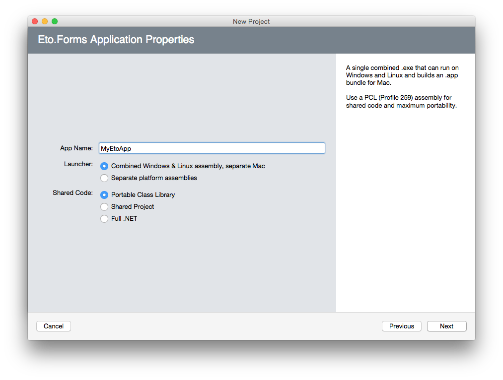
The addins for VS and XS have also been updated with an all new project template wizard to eliminate the confusion of multiple project template types. Check it out:
The Visual Studio extension is also now compatible with both VS 2013 and VS 2015.
Visual Studio Form Preview
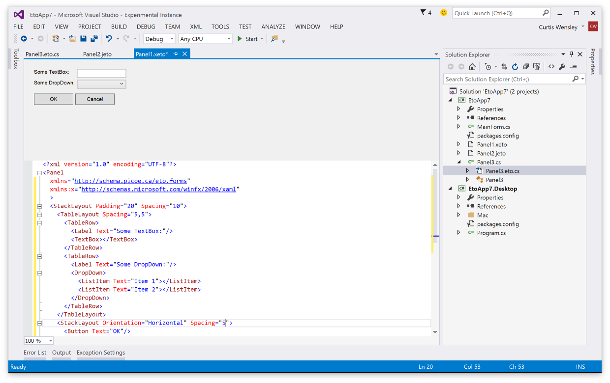
You can now preview your Xaml, Json, and code-based forms and controls right within the Visual Studio IDE!
Building an extension for VS feels like mashing the keyboard until something works, but it will no doubt be very useful so the pain was worth it. An example of it in action:
Update: Also, forgot to mention that VS will also underline any Eto.Drawing.Color reference/constructor with its actual color. This only works if you pass numeric values to the constructor, or use any of the values in Colors.*.
New Features
StackLayout
The new StackLayout provides a very clean api for simple layouts, giving you a quick and easy way to create a horizontal or vertical set of controls.
By default, the StackLayout will keep all your controls auto-sized. The HorizontalContentAlignment and VerticalContentAlignment properties (depending on Orientation) specify if the controls are aligned to the Left/Top, Right/Bottom, Center, or Stretch to fill the container. Each StackLayoutItem can also control the alignment for each item individually, and also specify an expand property to tell it to fill the available space.
For example:
var layout = new StackLayout
{
    Orientation = Orientation.Vertical,
    Spacing = 5,
    Padding = new Padding(10),
    HorizontalContentAlignment = HorizontalAlignment.Center,
    Items =
    {
        new Button { Text = "Click Me" }, // implicit conversion
        new StackLayoutItem(new TextArea(), HorizontalAlignment.Stretch, expand: true)
    }
}
The StackLayout is built upon the very versatile TableLayout currently, but will eventually be transitioned to a full fledged control.
Xamarin.Mac Unified
The latest version of Xamarin.Mac (unified) is now fully supported in both the mobile and net45 profiles. This will allow you to bundle the mono runtime with your app and publish to the app store. To use Xamarin.Mac, you need to purchase a license from Xamarin.
Note that the MonoMac platform does not require a Xamarin license, but requires your end users to install mono.
Binding enhancements
For more advanced MVVM capabilities, the abilitiy to bind to a System.Windows.Input.ICommand in your view model has been added to controls such as Button, RadioButton, and LinkButton, to name a few. You can use the Eto.Forms.Command as an implementation of ICommand.
ICommand binding is useful by allowing your view model to define the action and the enabled state of the command, which is automatically reflected in the UI.
In the .NET 4.0 build, a custom type of Eto.Forms.ICommand has been added which can be used similarly to the .NET 4.5 interface.
For example:
class MyModel
{
    public ICommand MyCommand
    {
        get { return new Command((sender, e) => Console.WriteLine("Executed!")); }
    }
}

class MyForm : Form
{
    public MyForm()
    {
        var button = new Button { Text = "Click Me!" };
        // bind the button's Command to the view model
        button.BindDataContext(b => b.Command, (MyModel m) => m.MyCommand);

        Content = new StackLayout { Items = { button } };

        // set the view model for the form
        this.DataContext = new MyModel();
    }
}
Binding support has also been added MenuItem and ToolItem.
Implicit string as a Label
There is now an implicit conversion from String to a Control so when you're creating UI labels you no longer have to create instances of Label explicitly. Combined with the initializer pattern for controls like the StackLayout, this works really nicely:
new StackLayout
{
    Items =
    {
        "Some label",
        new TextBox(),
        "Some other label",
        new Button { Text = "Click Me!" }
    }
}
Xaml from PCL
The Eto.Serialization.Xaml nuget package can now be used from your PCL projects. It uses the bait and switch trick, so you also need to add the package to your startup project for it to work. This is currently only available for desktop platforms.
New Controls
RadialGradientBrush
Rounding out the Graphics capabilities of Eto, the RadialGradientBrush has been added for more gradient options.
GradientWrapMode.Pad has also been added which works for the existing LinearGradientBrush as well.
Keyboard
A new Eto.Forms.Keyboard static class is added giving you access to the state of keyboard modifiers and key lock states for the CapsLock, NumLock, and Insert mode. Note that not all platforms support all lock keys, so check the Eto.Forms.Keyboard.SupportedLockKeys for which lock keys the platform supports.
Expander
The new Expander wraps the existing WPF ang Gtk Expander controls, and a custom implementation for WinForms and Mac platforms. It provides a way to show or hide additional controls on your form using a toggle button.
MaskedTextBox
The MaskedTextBox provides an easy to use and extensible masked input control for things like phone numbers, serial numbers, postal/zip codes, and also variable length formats like a numeric input.
This control uses the IMaskedTextProvider interface to determine how the mask functions, which Eto.Forms provides a few implementations:
- FixedMaskedTextProvider, which wraps .NET's MaskedTextProvider, but is usable from PCL code.
- VariableMaskedTextProvider which is an abstract base to easility implement variable-length masks.
- NumericMaskedTextProvider which is an implementation of the
VariableMaskedTextProviderthat allows for numeric input of any standard .net type such asint,long,float,double, etc.
ProgressCell
The ProgressCell is usable for the GridView and TreeGridView to show a progress bar as column in your grid. It binds to your model using a nullable float, with values of 0 - 1.0.
Control Enhancements
There have been tons of enhanced controls, here are some of the more notable enhancements:
Window.Owner
A new Window.Owner property has been added to create modeless dialogs using the Form class. Setting this property to another window will ensure the form is always above its owner, and in some cases (e.g. OS X), the child window will move along with its parent.
Button.MinimumSize
The Button control now exposes a MinimumSize property, which allows you to shrink the button to the size of its content. For example, if you are showing only a small image as the button content, you can set the MinimumSize to Size.Empty.
The default value of MinimumSize may be different for each platform to ensure buttons look the correct size in typical use cases.
NumericUpDown.MaximumDecimalPlaces
The NumericUpDown control as a new MaximumDecimalPlaces for cases when you want to show many decimal places, but only if needed. This control has also received numerous updates on all platforms to make its functionality more consistent.
TabControl.TabPosition
The TabControl now supports tabs on the Bottom, Left, and Right of the content.
TextArea.SpellCheck/SpellCheckIsSupported
The TextArea can now show incorrect spelling when TextArea.SpellCheck is set to true. This is only a hint, so check the value of TextArea.SpellCheckIsSupported to see if the current platform supports this feature. Currently only supported on WPF and OS X platforms.
TextBox.CaretIndex/Selection/SelectedText
The TextBox now allows you to control where the caret should be placed, and get/set what text is selected. This functionality is used for the new MaskedTextBox.
TextInput event
The Control.TextInput event has been implemented on all platforms to interpret proper text input on your controls. This ensures that different input methods, languages, etc can be properly handled.
This is also used for the MaskedTextBox to provide correct functionality, but you can also use it on controls like Drawable to provide your own completely custom input control.
Breaking Changes
In keeping (mostly) with SemVer, in 99.9% of the cases your code should compile with no changes in the new version. If not, only minor changes should be necessary.
Before updating to this version you should fix all obsolete warnings in your code so that the upgrade path is smooth.
Graphics Transforms and PixelOffsetMode
Graphics.PixelOffsetMode was incorrectly implemented on pretty much all platforms which caused elements to be drawn in the wrong location when applying a scale transform. The PixelOffsetMode.Half mode also no longer offsets the fill operations and behaves similarly to other graphics platforms. If you did not change the PixelOffsetMode in your application, this should not affect you.
Orientation enumeration
The various Orientation enumerations have been unified to a single Orientation enum. These are RadioButtonListOrientation, SplitterOrientation, and SliderOrientation which are now deprecated.
HorizontalAlign/VerticalAlign
The HorizontalAlign and VerticalAlign enumerations are now deprecated in favour of HorizontalAlignment, VerticalAlignment, and TextAlignment. These are used for the new StackLayout and also apply to the Label control.
Window.RestoreBounds
Window.RestoreBounds is no longer nullable, and will always return the size that the window should be restored to. Previously, this would only return a value when the window was fullscreen or minimized.
Binding moved to Eto.Forms namespace
All binding related classes were moved from Eto to the Eto.Forms namespace.
FileDialog.Filters changed from IEnumerable to Collection
The FileDialog.Filters is now a collection instantiated by the FileDialog. Previously you would have (using initializer pattern):
new OpenFileDialog
{
    Filters = new [] { new FileDialogFilter("My Files", ".my") }
}
Now it's simply:
new OpenFileDialog
{
    Filters = { new FileDialogFilter("My Files", ".my") }
}
Questions & Thanks
If there are any questions about the new release or its features, feel free to talk about it in the forums or on irc. Any issues should be filed in the github issue tracker.
I also want to thank all of the contributors to Eto.Forms that have submitted pull requests, created issues, added information on the wiki, or just helping to spread the word!

