Issue tickets have been created so that you can track your progress. As you complete a ticket, close it out.
- You should be using flexbox.
- You may use Bootstrap for Card Components
- Decide as a team how many branches you will need and what will happen on each branch (remember one feature per branch).
- While in
~/workspace/foundations/exercises, clone this repo - Create a setup branch and push up the usual stuff
Your task is to build a grid of cards for a company's products. Here are the requirements for the basic structure of the cards.
- Cards should be 3 per row.
- Each product should contain a
headerelement that, itself, contains anh2element where the product's title will be written. - The first section should contain three child block elements.
- The first element contains the product image.
- The second element contains the product description.
- The third element contains the product availability (e.g. "Available" or "Not Available")
- The second section contains product specifications.
- This section should have a header containing the word "Specifications"
- This section should contain two block elements
- The first block element specifies the size.
- The second block element specifies the weight.
- This section should contain a footer.
- The footer contains text stating when the product specifications become invalid.
- The third section contains the product pricing.
- This section should contain a header.
- This section should contain three block elements.
- Each block element contains information about the price for different quantities.
- The card title has a solid 1px border that is
lightblue. - The title and product image are centered.
- Notice that the text for the description in the image is justified.
- The text for the product specification details and pricing details is bold.
- The availability element extends the full width of the card, with a dark grey background and yellow text.
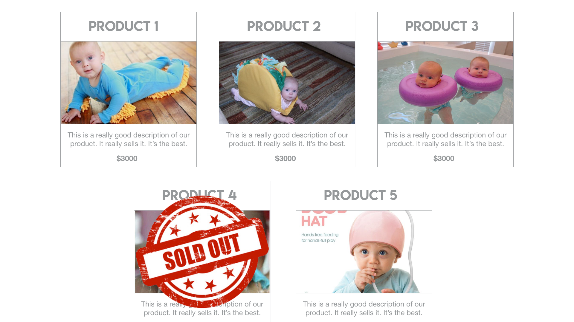
Here's an image that shows how the cards should appear. This visual example is a wireframe, which means it is only an example of layout. Style your cards based on the requirements and then use your own judgment after doing so. All the data needs to be on the cards.
- Pick font(s) from Google Font and include them in your project. You can use them wherever you want, but uh, don't make it too ugly.
- For items that are no longer available, place this image over top of the product card. Note this is complex positioning, it is going to challenge you.. What I mean by "over the product card" is

- Use CSS to conditionally apply styles depending on the width of the screen! (or the size of the browser window) You can do this using a fancy thing called media queries. You can find a good example of how to do that here.
