-
Notifications
You must be signed in to change notification settings - Fork 11
SimulRMSE
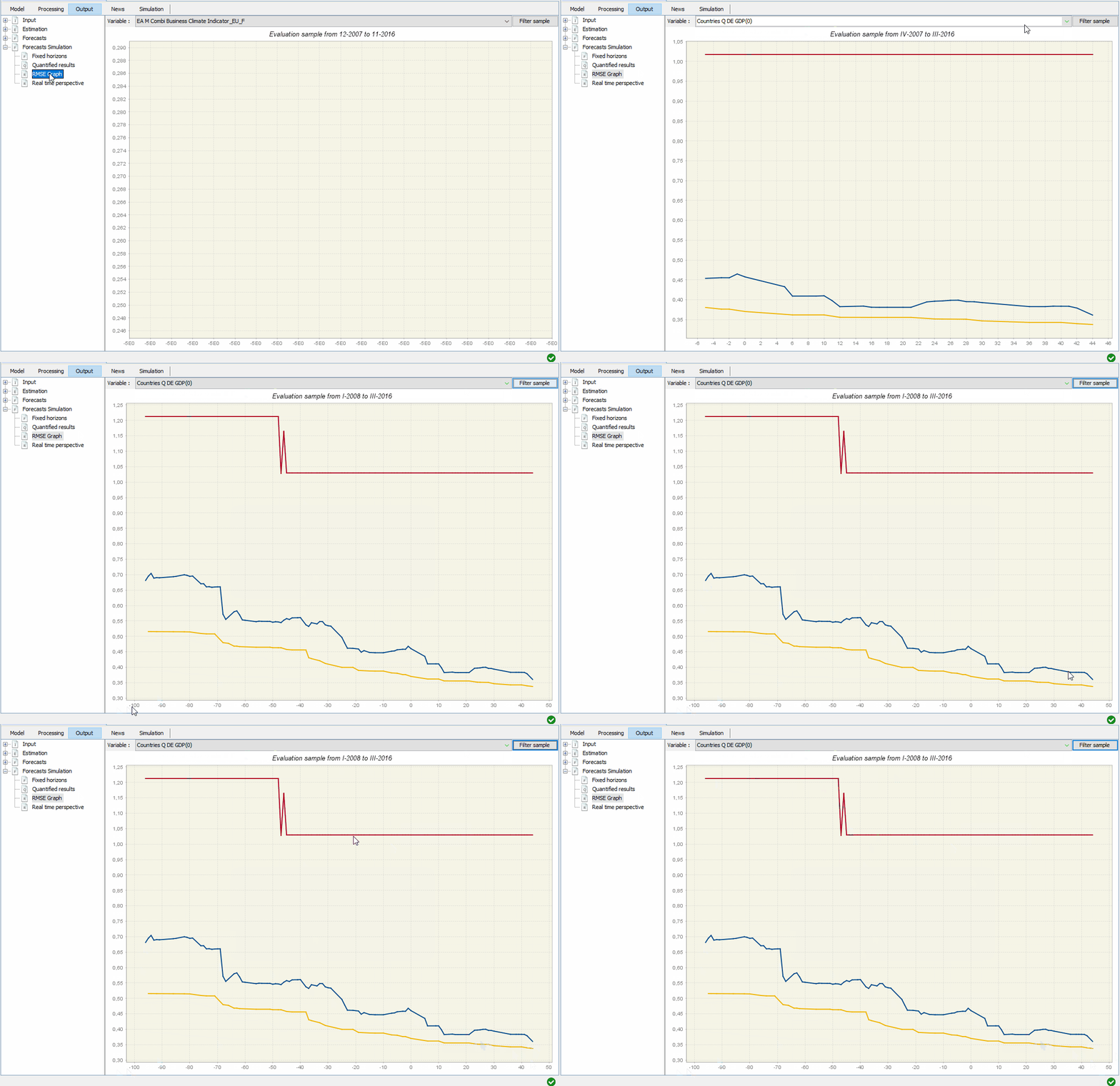
Rather than looking at the forecasts for each period of time, we can focus on the average performance of the model over a given sample in function of how close we are to the publication date of the target variable. The graph below represents the squared root mean squared error (RMSE) in the y-axis in function of the number of days before (-) or after (+) the end of the quarter (i.e. the forecasting horizon).
The blue line corresponds once again to the dynamic factor model, while the red line represents the RMSE of an ARIMA benchmark. The yellow line corresponds to the RMSE that would be expected from the model in the absence of misspecification if instead of having finite sample to evaluate the model we would have a large number of observations. In other words, the yellow line represents the theoretical uncertainty that users of the model can expect:
