Checkout our extensive docs to learn more about this package, the inspiration behind it and how to use it.
NavbarRouter is a complete package to handle all your BottomNavigationBar needs. It provides a simplest api to achieve the advanced features of BottomNavigationBar making the user experience of your app much better. You only need to specify the NavbarItems and the routes for each NavbarItem and NavbarRouter will take care of the rest.
Most of the features which this package provides are mainly to improve the user experience by handling the smallest things possible.
- Choose between different NavigationBar types.
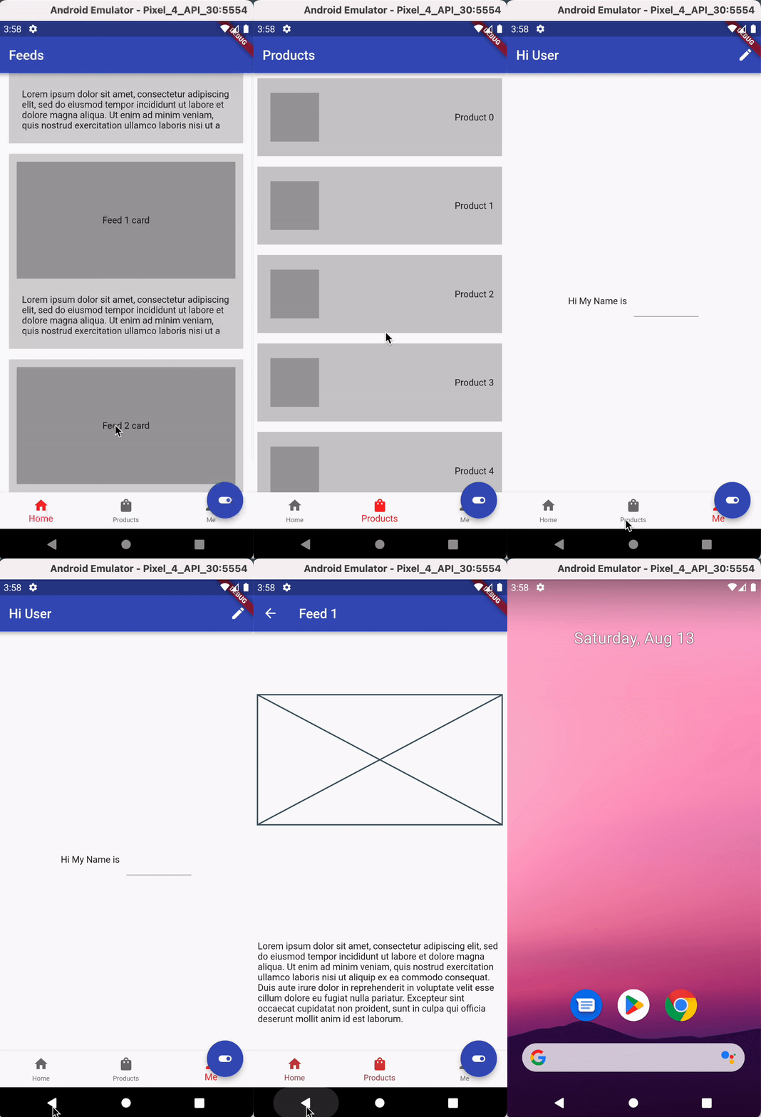
- Remembers navigation history of Navbar (Android).
- Persist Navbar when pushing routes
- Support for nested navigation.
- Intercept back button press to handle app exits (Android).
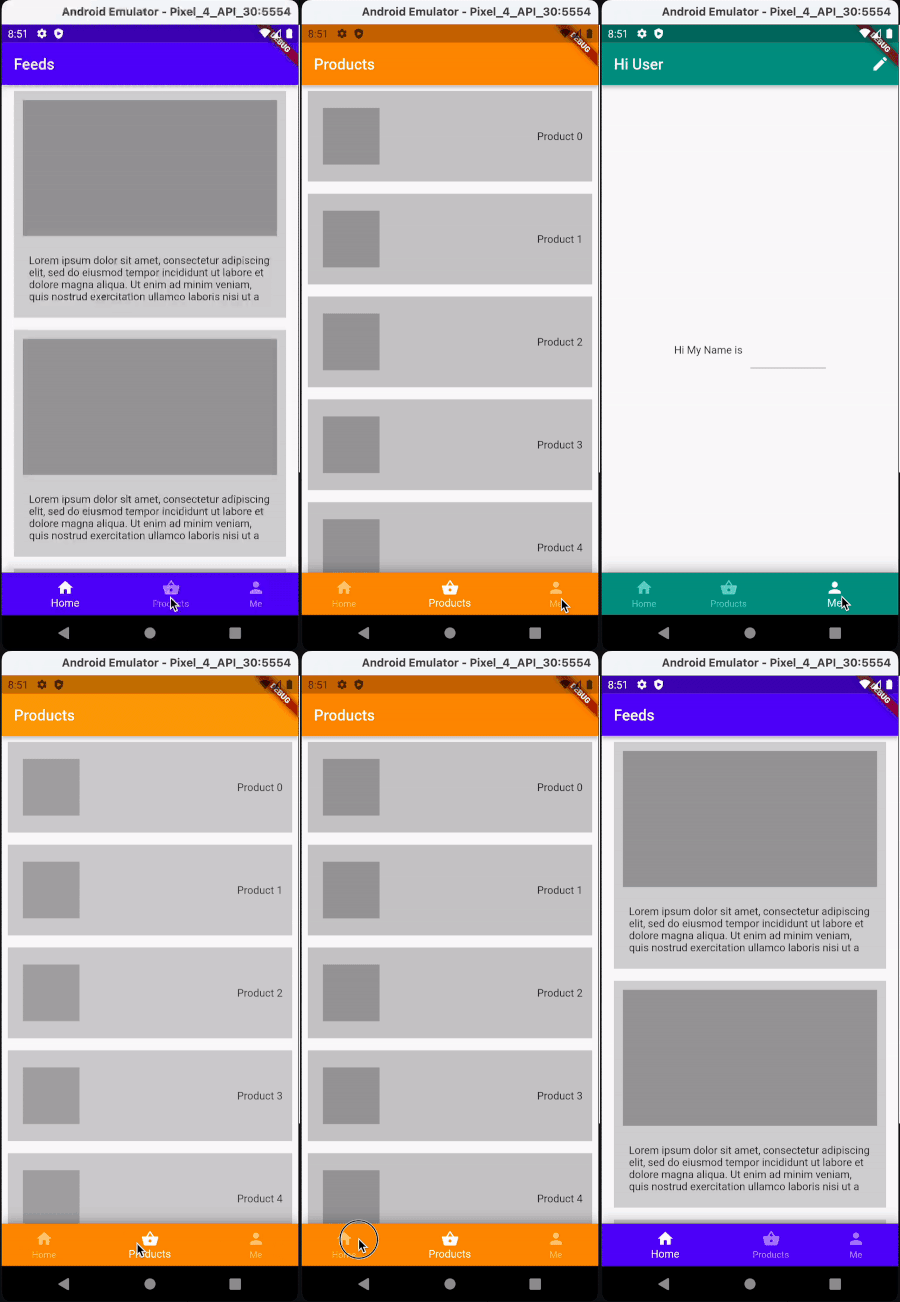
- Fading between NavbarDestinations
- Programmatically control state of bottom navbar from any part of widget tree e.g change index, hide/show bottom navbar,push/pop routes of a specific tab etc
- Show Snackbar messages on top of Navbar with a single line of code.
- persist state across bottom navbar tabs.
- Jump to base route from a deep nested route with a single tap(same as instagram).
- Adapatable to different device Sizes.
You can choose between different NavbarTypes using the NavbarDecoration.navbarType property. This allows you to choose between the default NavbarType.standard and NavbarType.notched NavbarTypes.
| NavbarType.standard (default) | NavbarType.notched |
|---|---|
 |
 |
| NavbarType.material3 | NavbarType.floating |
|---|---|
 |
 |
Heres a sample app built using this package to see how it works.
video demo of the sample app

This package will help you save atleast 50% lines of code in half the time required to implement the above features. Heres the same sample app without the package which requires around 800 lines of code.
Run from the root of your flutter project.
flutter pub add navbar_routerExample
class HomePage extends StatelessWidget {
  HomePage({Key? key}) : super(key: key);

  List<NavbarItem> items = [
    NavbarItem(Icons.home, 'Home', backgroundColor: colors[0]),
    NavbarItem(Icons.shopping_bag, 'Products', backgroundColor: colors[1]),
    NavbarItem(Icons.person, 'Me', backgroundColor: colors[2]),
  ];

  final Map<int, Map<String, Widget>> _routes = const {
    0: {
      '/': HomeFeeds(),
      FeedDetail.route: FeedDetail(),
    },
    1: {
      '/': ProductList(),
      ProductDetail.route: ProductDetail(),
    },
    2: {
      '/': UserProfile(),
      ProfileEdit.route: ProfileEdit(),
    },
  };

  @override
  Widget build(BuildContext context) {
    return NavbarRouter(
      errorBuilder: (context) {
        return const Center(child: Text('Error 404'));
      },
      onBackButtonPressed: (isExiting) {
        return isExiting;
      },
      destinationAnimationCurve: Curves.fastOutSlowIn,
      destinationAnimationDuration: 600,
      decoration:
          NavbarDecoration(navbarType: BottomNavigationBarType.shifting),
      destinations: [
        for (int i = 0; i < items.length; i++)
          DestinationRouter(
            navbarItem: items[i],
            destinations: [
              for (int j = 0; j < _routes[i]!.keys.length; j++)
                Destination(
                  route: _routes[i]!.keys.elementAt(j),
                  widget: _routes[i]!.values.elementAt(j),
                ),
            ],
            initialRoute: _routes[i]!.keys.first,
          ),
      ],
    );
  }
}When the selected NavbarItem is at the root of the navigation stack, pressing the Back button (On Android) will by default trigger app exit.
For instance:
Your app has three tabs and you navigate from Tab1 -> Tab2 -> Tab3
-
BackButtonBehavior.exit(default) when you press Back Button (on Tab3) your app will exit -
BackButtonBehavior.rememberHistory, This will switch the navbar current index to the last selected NavbarItem (Tab 2) from the navbarHistory.
You can read more about this feature here.
You can have smooth Transitions between NavbarDestinations by setting the destinationAnimationCurve and destinationAnimationDuration properties.
defaults to
  destinationAnimationCurve: Curves.fastOutSlowIn,
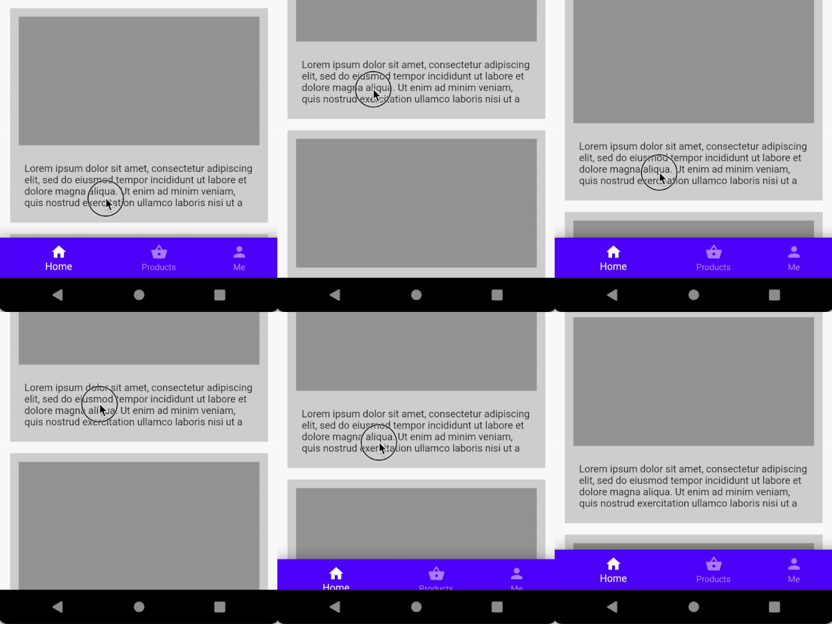
destinationAnimationDuration: 700,You can hide or show bottom navigationBar with a single line of code from anywhere in the widget tree. This allows you to handle useCases like scroll down to hide the navbar or hide the navbar on opening the drawer.
NavbarNotifier.hideBottomNavBar = true;| Hide/show navbar on scroll | Hide/show navbar on drawer open/close | Consistent behavior across all Navbars |
|---|---|---|
 |
 |
 |
You can show a snackbar on top of the navbar by using the NavbarNotifier.showSnackBar method.
NavbarNotifier.showSnackBar(
  context,
  "This is shown on top of the Floating Action Button",
  /// offset from bottom of the screen
  bottom: state.hasFloatingActionButton ? 0 : kNavbarHeight,
);
And hide it using the NavbarNotifier.hideSnackBar method.
NavbarNotifier.hideSnackBar(context);navbar_router provides a onBackButtonPressed callback to intercept events from android back button, giving you the ability to handle app exits so as to prevent abrupt app exits without users consent. (or you might want to implement double press back button to exit).
This callback method must return true to exit the app and false other wise.
sample code implementing double press back button to exit
onBackButtonPressed: (isExitingApp) {
  if (isExitingApp) {
    newTime = DateTime.now();
    int difference = newTime.difference(oldTime).inMilliseconds;
    oldTime = newTime;
    if (difference < 1000) {
      hideSnackBar();
      return isExitingApp;
    } else {
      showSnackBar();
      return false;
    }
  } else {
    return isExitingApp;
    }
}, NavbarRouter(
errorBuilder: (context) {
return const Center(child: Text('Error 404'));
},
isDesktop: size.width > 600 ? true : false,
decoration: NavbarDecoration(
isExtended: size.width > 800 ? true : false,
navbarType: BottomNavigationBarType.shifting),
...
...
);backButtonBehavior:An enum which decides, How the back button is handled, defaults to BackButtonBehavior.rememberHistory.
destinations: A List of DestinationRouter to show when the user taps the [NavbarItem].
Each DestinationRouter specifies a List of Destinations, initialRoute, and the navbarItem corresponding to that destination.
type: The type of NavigationBar to be passed to NavbarRouter defaults to NavbarType.standard. This allows you to choose between the default NavbarType.standard and NavbarType.notched.
decoration : The decoraton for Navbar has all the properties you would expect in a [BottomNavigationBar] to adjust the style of the Navbar.
destinationAnimationCurve: Curve for the destination animation when the user taps a navbar item. Defaults to Curves.fastOutSlowIn.
destinationAnimationDuration: The duration in milliseconds of the animation of the destination. Defaults to 700ms.
errorBuilder: A WidgetBuilder to show the user when the user tried to navigate to a route that does not exist in the [destinations].
initialIndex: Navbar item that is initially selected, defaults to the first item in the list of [NavbarItems]
isDesktop: if true, navbar will be shown on the left, this property can be used along with NavbarDecoration.isExtended to make the navbar adaptable for large screen sizes.
onBackButtonPressed: A function which defines whether it is the root Navigator or not. if the method returns true then the Navigator is at the base of the navigator stack
onChanged: A callback that is called when the currentIndex of the navbarchanges.
shouldPopToBaseRoute: A boolean which decides, whether the navbar should pop to the base route (pop all except first) when the current navbar is tapped while the route is deeply nested. This feature is similar to Instagram's navigation bar defaults to true.
onCurrentTabClicked: A callback that is called when the selected navbar is tapped again. (This allows you to handle useCases like scroll to top when the navbar is tapped again or Pop to the base route similar to Instagram.)
Read more in a medium blog post for detailed explanation.
Youtube: Heres a discussion I had with Allen Wyma from Flying high with Fluter regarding this package.
Contributions are welcome! for more details on how to contribute, please see the contributing guide


