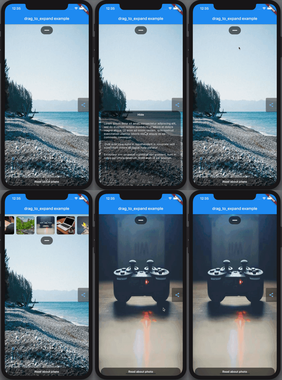
This widget is easy to use to create draggable panels.
Showcase which you can find in example
DragToExpandController _dragToExpandController;

@override
void initState() {
  // Controller is used for programmatically opening and closing widget. If you don't need this feature - dont' create it.
  _dragToExpandController = DragToExpandController();
  // controller has:
  //   bool get isOpened - return true if widget is opened and false if not
  //   set isOpened(bool v) - setter, will close/open if v doesn't equal to
  //     isOpened, if it is - will do nothing.
  //   toggle() - close/open widget depends on its status
  super.initState();
}
@override
dispose() {
  _dragToExpandController?.dispose();
  super.dispose();
}

@override
Widget build(BuildContext context) {
  return Scaffold(
    body: Stack(
      children: <Widget>[
        Align(
          alignment: Alignment.center,
          child: OutlineButton(
            onPressed: () => _dragToExpandController.isOpened = !_dragToExpandController.isOpened,
            child: Text('open/close programmatically'),
          )
        ),
        Align(
          alignment: Alignment.bottomCenter,
          child: DragToExpand(
            controller: _dragToExpandController, // controller

            // Min and max size is height or width - it depends on baseSide parameter.
            // For example if baseSide was set to bottom or top, then min and max size
            // will be responsible for height, otherwise - it will be width.

            // minimum size of widget, default and in most cases sould be 0,
            // use it when you want a part of widget to be visible in closed state (as a visual teaser for example)
            minSize: 0,

            // maximum size
            maxSize: MediaQuery.of(context).size.height * 0.3,

            // "Basis" of the widget where content will slide, can be top, bottom, left or right.
            baseSide: BaseSide.bottom,

            // If "true" - the widget will close and open on tap on draggable, otherwise user will have to drag to open
            toggleOnTap: true,

            // @required Widget inside GestureDetector used to open and close a child
            draggable: Center(child: Text('drag to open')),

            // If you want the draggable to be changed when it's opened - define this parameter, by default it's null.
            draggableWhenOpened: Center(child: Text('close')),

            // @required Just child
            child: Container(color: Colors.yellow),

            //
            clipOverflow: true,

            // animation duration
            animationDuration: 500,
          ),
        ),
      ],
    ),
  );
}