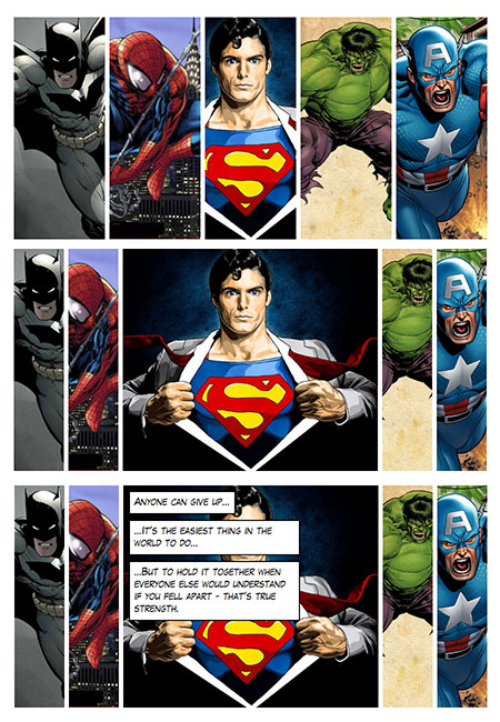
When a learner hovers on one of the images, it widens and the other images narrow accordingly. If set, then an array of captions will appear. Positions and timings of these can be customised.
Click here for an interactive demo
##Installation
Run the following from the command line: adapt install adapt-blinds
The attributes listed below are used in components.json to configure Blinds, and are properly formatted as JSON in example.json.
_component (string): This value must be: blinds. (One word.)
_setCompletionOn (string): This value determines when the component registers as complete. Acceptable values are "allItems" and "inview". "allItems" requires each blind to be visited. "inview" requires the Blinds component to enter the view port completely.
height (number): Height in pixels. Defaults to 500 if this property is not defined.
_expandBy (number): The amount to expand the blind by when hovering over it. Defaults is 2 (width of the blind doubles).
_items (string): Each item represents one image for this component and contains values for _graphic and captions.
src (string): The image to be used for the blind item. Since the image is used as a background image for a
divno src, alt or title attributes are required
_captions (array): An optional array of captions for the image.
text (string): Each caption must have a _text property. This is the text to be displayed inside the caption.
top (mixed): Each caption can contain optional top, left and width values to position them on the image. Values can be given as a number or string. A number will be interpreted as pixels but a string value may be used to specify a percentage (eg. "20%"). Default is 0. Multiple captions appear 10px below the previous one unless this value is specified.
left (mixed): Specify the position of the caption from the left. Value can be given as a number or a string. Default is 0;
width (mixed): Specify the max width of the caption. Value can be given as a string or a number. Default behaviour is to fit the width of the text
Viewport sizing
Author / maintainer: Dan Storey
