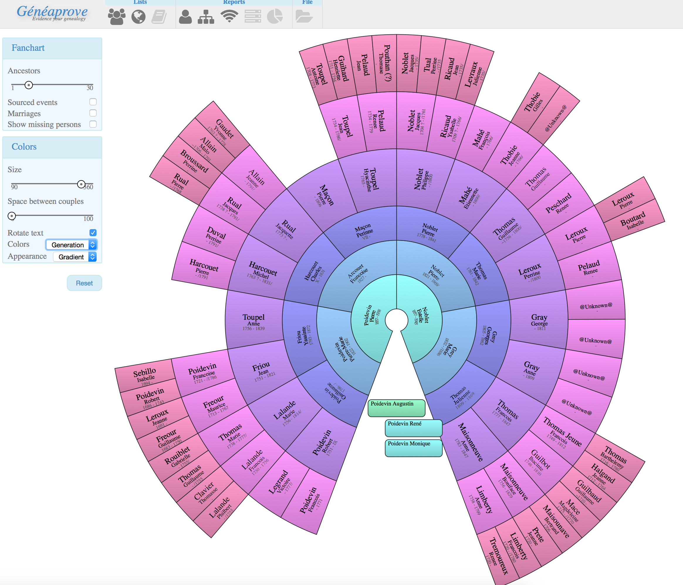
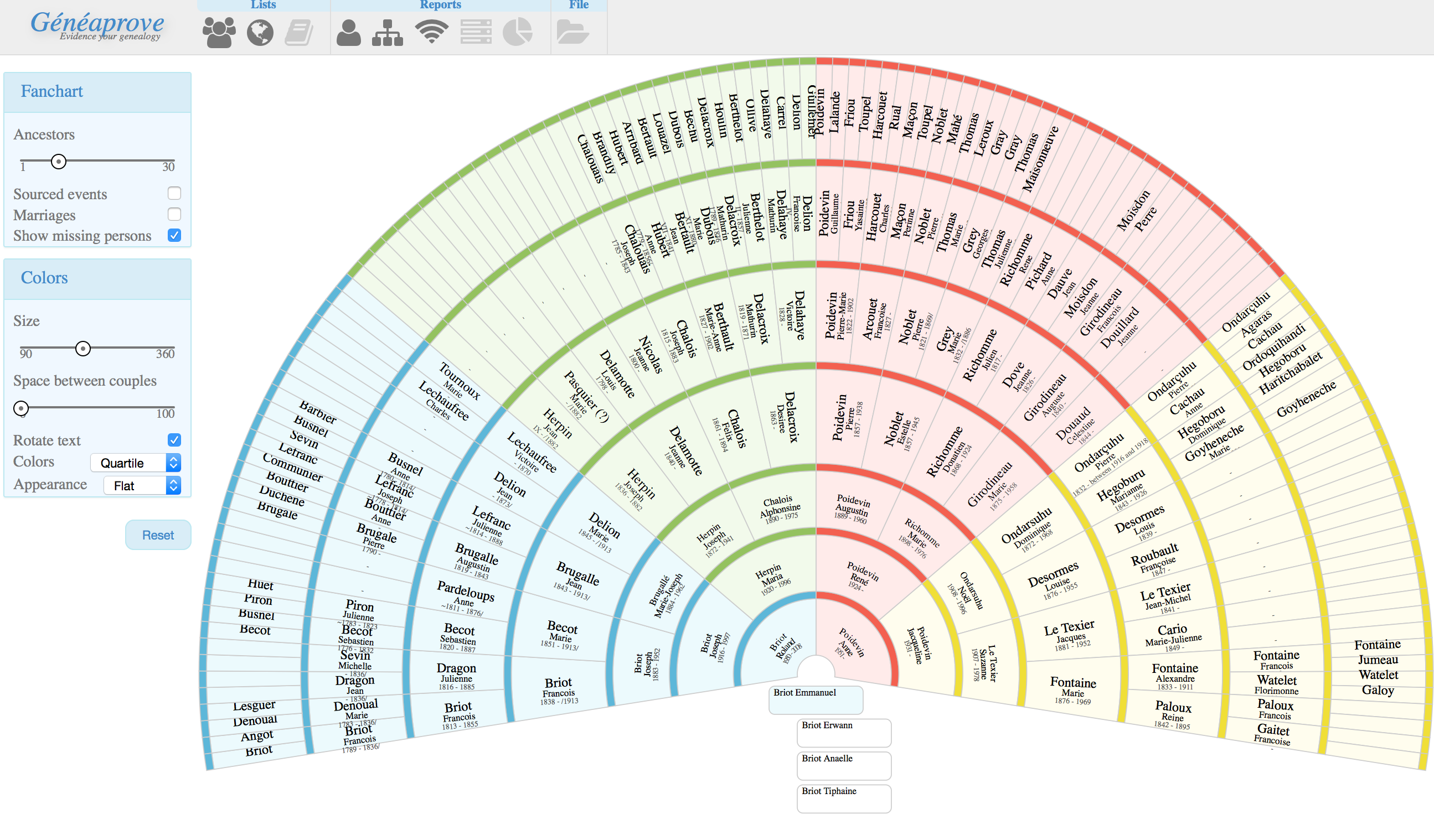
Fanchart
Instead of displaying the ancestors as a tree, this report will show them in a circle. This is less frequently used, but is a much more compact way to see lots of generations in a single view.
The same highlighting rules apply in the fanchart, although as seen in the screenshots it is also possible to use different color schemes, based for instance on the location of the person in the fanchart. This last colorscheme is less useful to investigate your data, but much nicer to print.