-
Notifications
You must be signed in to change notification settings - Fork 56
Widget UI
Following the merge and release of https://github.com/biolab/orange-widget-base/pull/130, widgets will look a bit different.
Up until now, when making a widget, you'd make a list of controls, slap a box on it, and put it in self.controlArea. We've now made some effort to establish visual consistency between widgets, adhering to the following guidelines as closely as possible. Herein, box refers to a group of controls, and frame refers to the use of the box=None kwarg in the orangewidget.gui library.
- if a box has a single labelled control, move the control's label into the box's label
- if a box of controls only has controls of one type (e.g., a list of checkboxes), don't put a frame on it (
gui.button(..., box=None)) - if a box of controls has mixed controls (e.g., four comboboxes and a checkbox), put a frame on it, and give it a descriptive name (
gui.hBox(..., box='Good name')) - don't use frames without names (avoid
gui.hBox(..., box=True)); these render weird on Mac and some Linux window managers


When making boxes of controls, if possible, don't mix control types. It makes margins/spacing on macOS not look as nice.
For a better understanding of macOS rendering, see https://doc.qt.io/archives/qq/qq23-layouts.html. TL;DR: macOS adjusts spacing and margin between elements depending on their type and positioning. A complex control (e.g., labeled combobox) is implemented as a horizontal box. Because its understanding of control types is opaque, it uses a large margin, even though a label or a combobox margin would be smaller.
Widgets which don't show visualizations put all of their controls into self.controlArea. You might notice an increased bottom margin, like so:


That's because, at the bottom, there's now a buttonsArea.
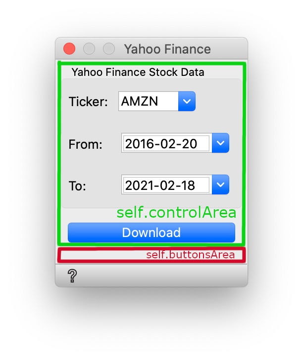
This separation of self.controlArea and self.buttonsArea allows us to implement scrolling in widgets with a main area, while always showing the tools:
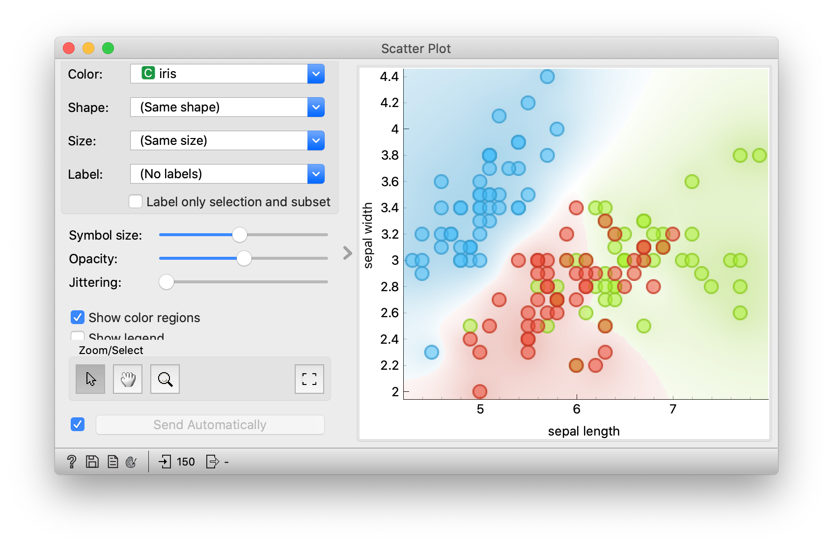
self.buttonsArea also has a some left and right margin, so the controls at the bottom are nicer aligned:
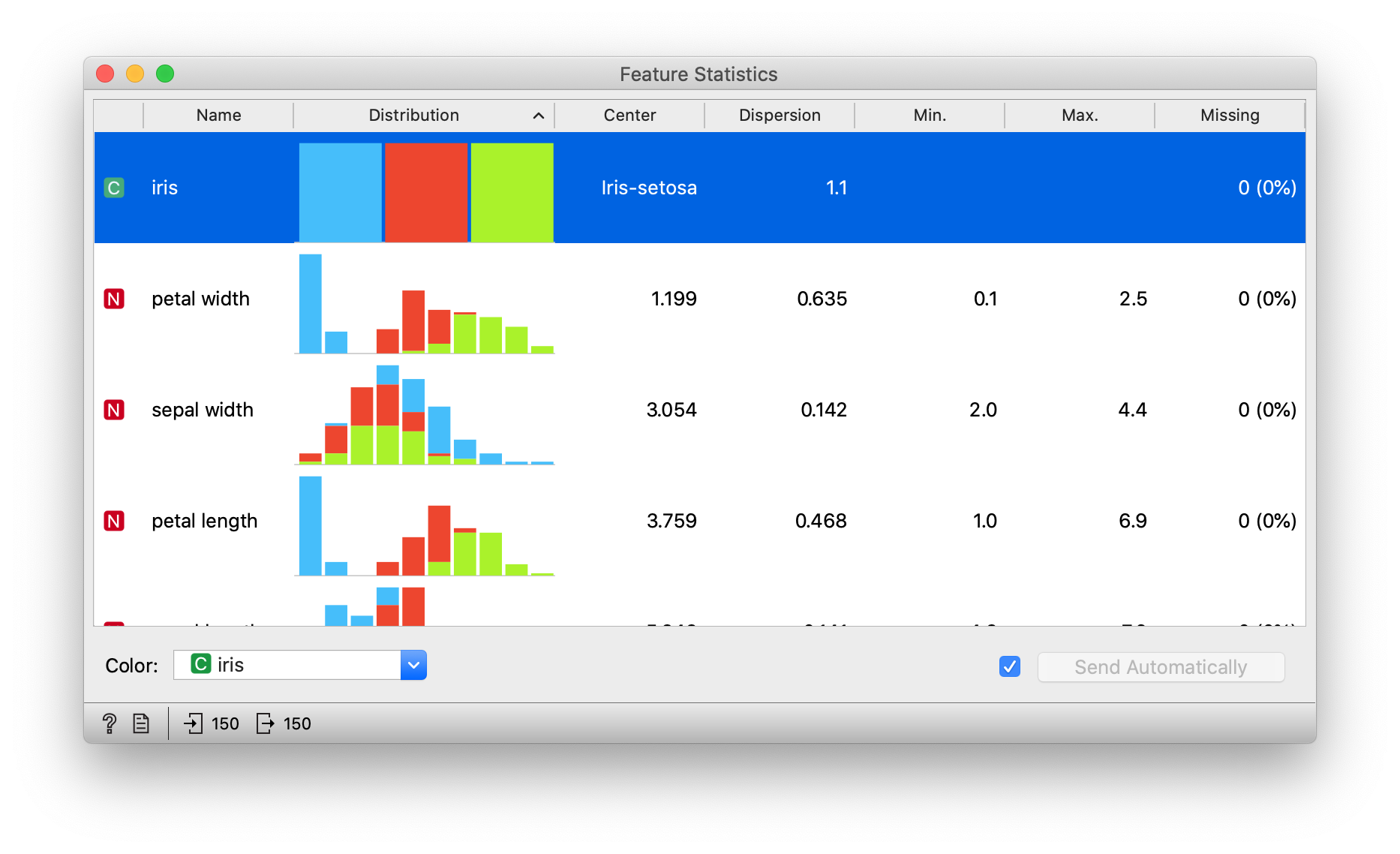
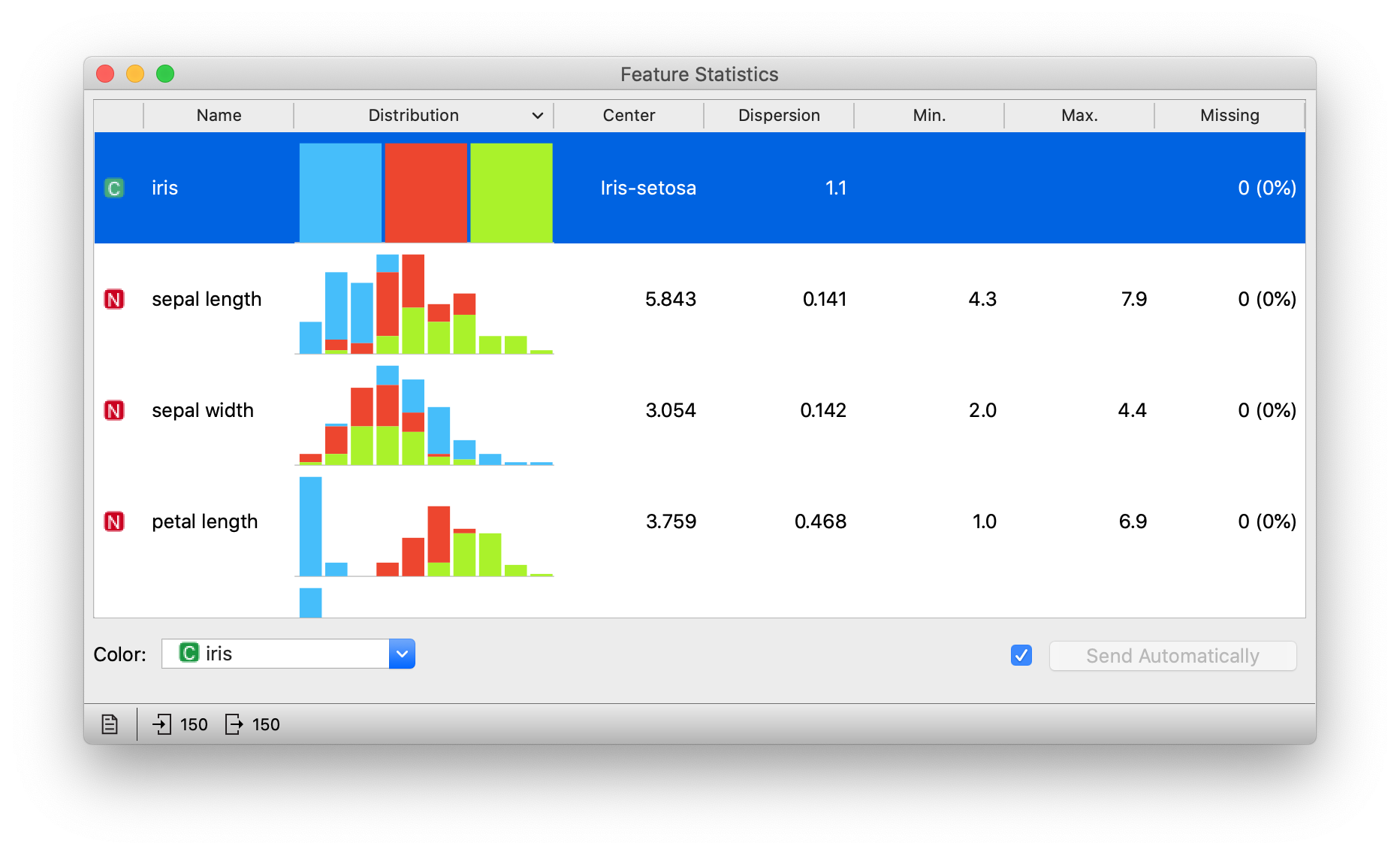
To fix up Yahoo Finance, we have to move the Download button to self.buttonsArea.


Most of the changes needed to accommodate the new orange-widget-base will be as simple as this. For most widgets, you just move the auto_commit checkbox/button into the buttonsArea.
Unless you're a PyQt wizard, if you're setting custom spacings/margins, or setting magic kwargs like addSpaceBefore=True, you're probably doing something wrong. Keep it simple with the gui package. This comes with the bonus of your code being much more likely to not need future maintenance in case of deprecations/changes in behavior.
self.buttonsArea is horizontal by default. If you want a vertical self.buttonsArea, set buttons_area_orientation = Qt.Vertical.
We enable self.buttonsArea by default to encourage a visual standard across widgets. But some widgets don't need a self.buttonsArea. In this case, set the module level variable buttons_area_orientation = None.
Lastly, if you mix control types, set the Qt.WA_LayoutUsesWidgetRect attribute on elements in the box. It only makes a difference on Mac, when using complex controls. Notice the horizontal misalignment of the checkbox:


See https://doc.qt.io/archives/qq/qq23-layouts.html for more details on MacStyle in Qt.