The Xanadu Sphinx Theme (XST) is a Sphinx theme used for open-source Xanadu software projects.
A fork of the Guzzle Sphinx theme, the theme has the following features:
- Responsive. Fluid layout that automatically adjusts for phone, tablet, and computer screens.
- LaTeX Macros. Comes with built-in support for MathJAX and common predefined quantum optics LaTeX macros.
- Cohesive Design. Unifies the appearance of all Xanadu Sphinx documentation.
The Xanadu Sphinx Theme requires Python 3.7 or later. The latest version of the
XST can be installed directly from the GitHub repository using pip:
pip install xanadu-sphinx-themeOnce installed, simply add or modify the following variables of your Sphinx
conf.py configuration file to start using the Xanadu Sphinx Theme:
from xanadu_sphinx_theme import templates_dir

# Add Xanadu Sphinx Theme autosummary templates
templates_path = [templates_dir()]

html_theme = "xanadu"

html_theme_options = {
    "navbar_name": "Example Project",
    "navbar_logo_colour": "#123456",

    "navbar_home_link": "https://example.com",

    "github_repo": "",
    "navbar_left_links": [
        {
            "name": "Tutorials",
            "href": "https://example.com/tutorials",
            "img": "_static/tutorial.png",
            "img_width": "30px",
        },
        {
            "name": "Install",
            "href": "install.html",
        },
        {
            "name": "Documentation",
            "href": "index.html",
            "active": True,
        }
    ],

    "navbar_right_links": [
        {
            "name": "FAQ",
            "href": "https://example.com/faq.html",
            "icon": "fas fa-question",
        },
        {
            "name": "GitHub",
            "href": "https://github.com/XanaduAI/example",
            "icon": "fab fa-github",
        }
    ],

    "extra_copyrights": [
        "TensorFlow, the TensorFlow logo, and any related marks are "
        "trademarks of Google Inc."
    ],

    "google_analytics_tracking_id": "UA-116279123-2",

    "prev_next_button_colour": "#b13a59",
    "prev_next_button_hover_colour": "#712b3d",
    "toc_marker_colour": "#b13a59",
    "table_header_background_colour": "#ffdce5",
    "border_colour": "#b13a59",
    "text_accent_colour": "#b13a59",
}The Xanadu Sphinx Theme supports the following options. These should be added to
the html_theme_options dictionary in your conf.py file.
google_analytics_tracking_id- Google Analytics tracking ID to enable website analytics.
github_repo- The GitHub organization and repository associated with the documentation. E.g.,
for a GitHub repository https://github.com/Organization/repo, this should be
"github_repo": "Organization/repo".
The following options customize the appearance of the navigation bar.
navbar_name- Name of the project to appear in the navigation bar.
navbar_wordmark_path- Path to the project wordmark to appear in the navigation bar. Specifying this option will replace the project logo and name in the navigation bar.
navbar_logo_alt- Alternative text to display in lieu of the wordmark or logo in the navigation bar.
Defaults to the value of
navbar_name. navbar_logo_path- Path to the project logo that appears in the navigation bar. Defaults to
_static/xanadu_logo.svgwhich points to the generated Xanadu (X) logo logo (seenavbar_logo_colour). navbar_logo_colour- Colour of the auto-generated Xanadu (X) logo (available at
_static/xanadu_logo.svg). Defaults to#000000(i.e., black). navbar_home_link- Link that is opened when the name or logo on the navigation bar is clicked.
Defaults to
index.html. navbar_left_linksLinks on the LHS of the navigation bar in the form of a list of dictionaries with the
"name","href", and optionally,"external"and"dropdown"keys.The
"external"key only determines if an "external link" icon should be displayed next to the name of the link in the navbar. Otherwise, the value of the"dropdown"key is another list of dictionaries of the same form (except for the"dropdown"key) and specifies the links which should be displayed in a dropdrown from the current link.In addition, the
"img"key can be used to specify an image to replace the navbar link, alongside"img_width"to specify the width of the image.navbar_right_links- Links on the RHS of the navigation bar in the form of a list of dictionaries
with the
"name","href", and optionally,"icon"keys. If a link does not have an"icon"key, it will be displayed as a solid button.
The following options customize the table of contents.
toc_overview- If
True, the project name, and a link to the homepageindex.rst, is included in the left-hand table of contents. toc_global- Whether to show the global table of contents by default via the left sidebar.
If
False, then the left sidebar will be disabled. toc_subset- If set to
True, and the current page has no local table of contents, the right-hand table of contents will instead display the current subset of the document tree. That is, the right-hand ToC will display the location in the document of the current page. IfFalse, and the current page has no local table of contents, no right-hand ToC will be shown. relations- If
True, then Next and Previous buttons are included at the bottom of every page, allowing navigation according to the table of contents.
The following options customize the appearance of the footer.
extra_copyrights- List of extra copyright notices to place in the footer.
footer_aboutA dictionary of the form
"footer_about": {
    "title": "Title",
    "icon": "https://...",
    "href": "https://...",
    "description": "Description"
}
that specifies the 'About' section of the footer.
footer_linksA list of dictionaries of the form
"footer_links": [
    {
        "title": "Column1",
        "links": [
            {
                "name": "Home",
                "href": "https://pennylane.ai/",
            },
            {
                "name": "Learn",
                "href": "https://pennylane.ai/qml",
            }
        ]
    },
    {
        "title": "Column2",
        "links": [...]
    }
]
that specifies footer links. Each top-level dictionary in the list is a separate titled column. Set to an empty list to remove.
footer_social_iconsA list of dictionaries of the form
"footer_social_icons": [
    {
        "name": "Twitter",
        "icon": "fab fa-twitter",
        "href": "https://twitter.com/xanaduai"
    },
    {
        "name": "GitHub",
        "icon": "fab fa-github",
        "href": "https://github.com/XanaduAI"
    },
    ...
]
specifying social media icons.
iconshould correspond to a Boxicons icon. Set to an empty list to remove.footer_taglinesA list of dictionaries of the form
"footer_taglines": [
    {
        "text": "Some text",
        "href": "https://..."
    },
    {
        "icon": "Some more text",
        "href": "https://..."
    },
    ...
]
specifying tagline hyperlinks that appear underneath the social media icons. Set to an empty list to remove.
footer_policiesA list of dictionaries of the form
"footer_policies": [
    {
        "text": "Some text",
        "href": "https://..."
    },
    {
        "icon": "Some more text",
        "href": "https://..."
    },
    ...
]
specifying policy hyperlinks that appear at the bottom of the footer. Set to an empty list to remove.
The following options allow the colours of various theme elements to be altered.
These should be fully qualified CSS color specifiers such as #004B6B or
#444.
border_colour- Border colour of accent rules and table headers.
code_colour- Colour of code blocks and teletype text. Defaults to
#8D1A38. prev_next_button_colourandprev_next_button_hover_colour- Colours of the "Next" and "Previous" navigation buttons located at the bottom of most pages.
social_icon_colour- Colour of the social icons.
table_header_background_colour- Background colour of table headers.
text_accent_colour- Accent colour for text such as download links.
toc_marker_colour- Colour of the marker beside the current ToC entry.
toc_mobile_heading_colourandtoc_mobile_heading_background_colour- Text and background colours of the mobile ToC heading.
The Xanadu Sphinx Theme implements the custom Sphinx directives listed below. For more information, consult the relevant Python module in the directives package.
<No example is available yet.>
Details
.. details::
    :title: Usage Details

    In general, the block takes :math:`D` parameters and **must** have the following signature:

    .. code-block:: python

        unitary(parameter1, parameter2, ... parameterD, wires)

    For a block with multiple parameters, ``n_params_block`` is equal to the number of parameters in ``block``.
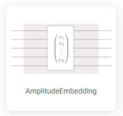
For a block with a single parameter, ``n_params_block`` is equal to the length of the parameter array... gallery-item::
:description: :doc:`AmplitudeEmbedding <../code/api/pennylane.AmplitudeEmbedding>`
:figure: _static/templates/embeddings/amplitude.png.. index-card::
:name: Using PennyLane
:link: introduction/pennylane.html
:description: A guided tour of the core features of PennyLane<No example is available yet.>
.. title-card::
    :name: 'lightning.qubit'
    :description: A fast state-vector qubit simulator written in C++
:link: devices.html<No example is available yet.>
- Source Code: https://github.com/XanaduAI/xanadu-sphinx-theme
- Issue Tracker: https://github.com/XanaduAI/xanadu-sphinx-theme/issues
If you are having issues, please let us know by posting the issue on our Github issue tracker.
The Xanadu Sphinx Theme is free and open source, released under the Apache License, Version 2.0.


