These charts represent a data science project that I have been dabbling for awhile now. This project has allowed me to learn more of the tools used for Data Science such as Pandas and Matplotlib.
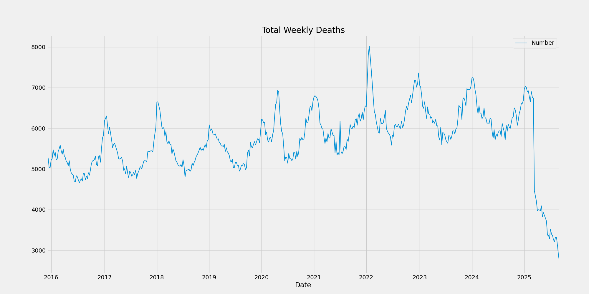
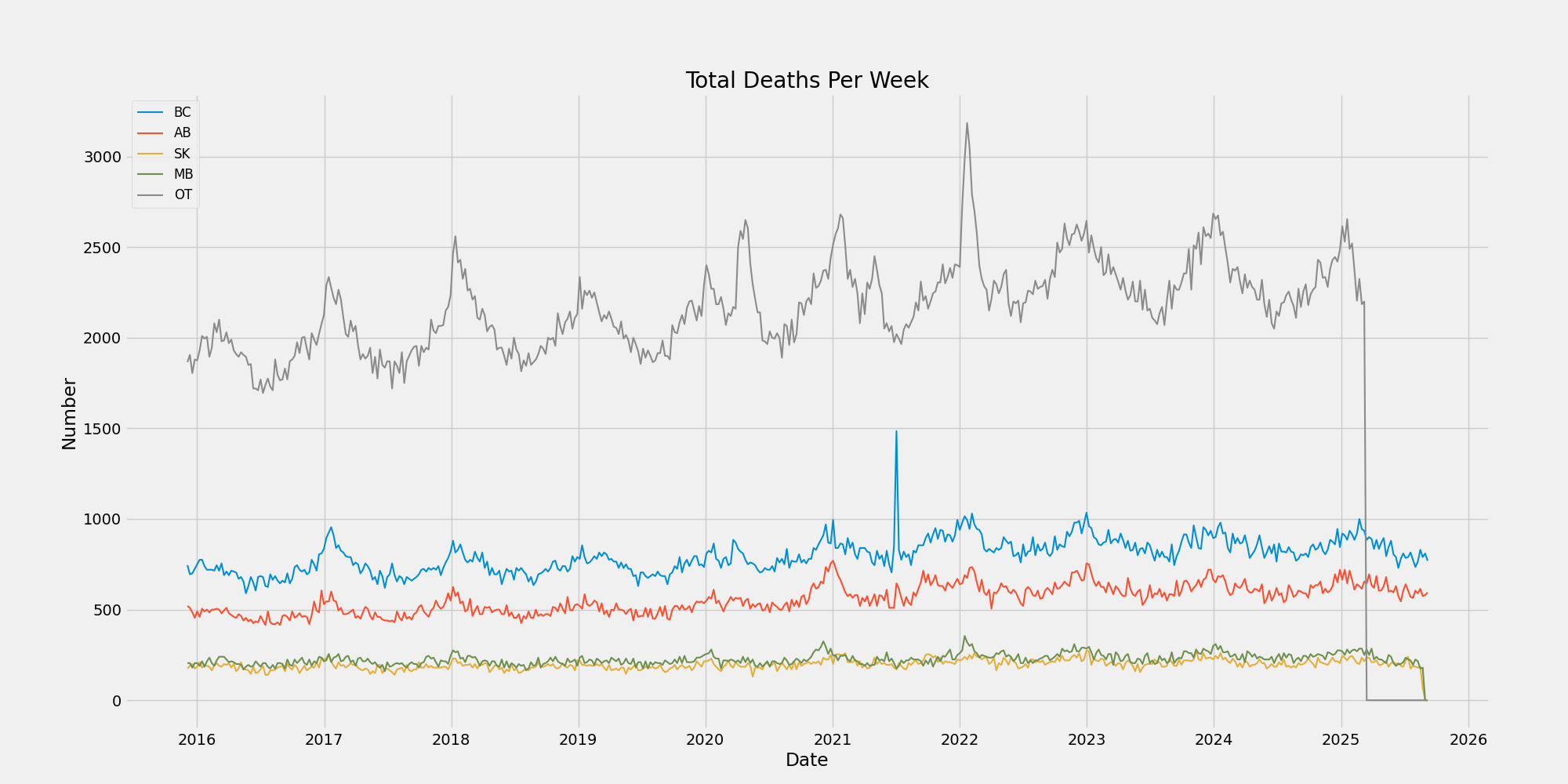
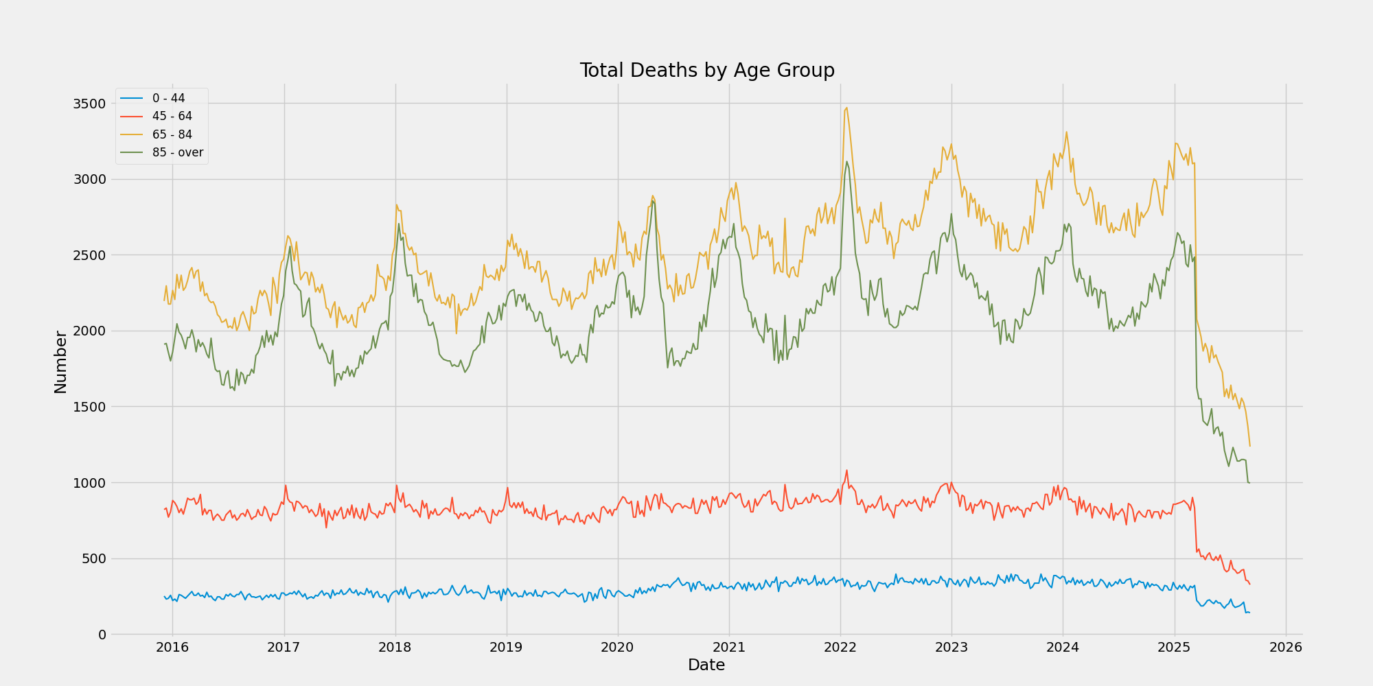
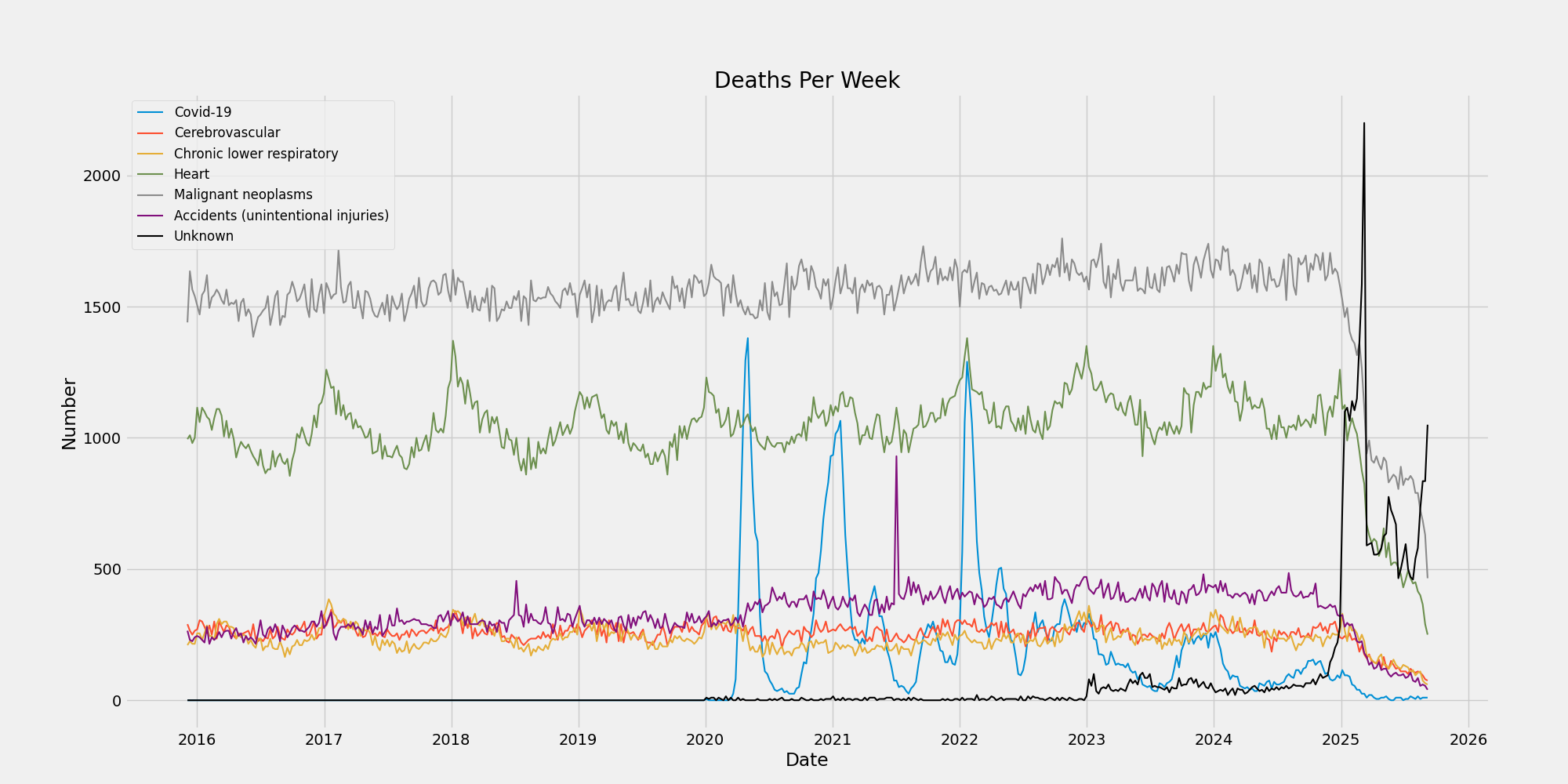
I have also been working on this project to show that canadian death rates have not increased dramatically due to COVID-19. As clearly shown in the data below there has been no significant increase in overall deaths due to the current pandemic.
The purpose of this data is not to draw any conclusions about the virus or its deadliness, this has been well documented as a slightly more deadly version of the common flu, a fact that I believe can be clearly seen with the yearly rise and fall of deaths during flu season not only since 2019 but over the last 10 years in it's entirety.
The only conclusion I will draw is that if you repeatedly tell the populous how many people are dying from any disease you will create panic. This is clearly evident in the fact that both diseases of the heart and Cancer have remained higher than Covid deaths for the duration of the pandemic.


