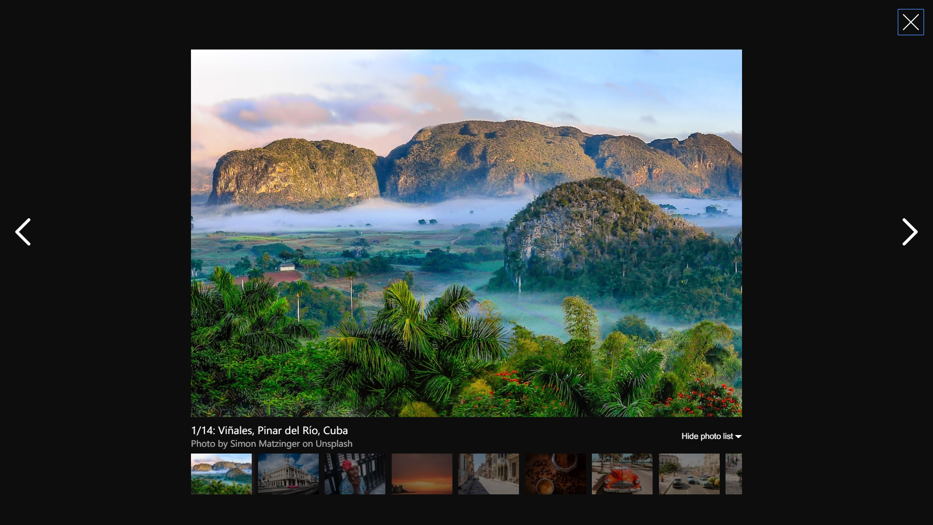
Simple photo gallery based on React and Airbnb image gallery
https://peterpalau.github.io/react-bnb-gallery/
You can install the react-bnb-gallery from npm.
npm install --save react-bnb-galleryFollowing code is simplest usage.
import React, { Component } from 'react'

import ReactBnbGallery from 'react-bnb-gallery'

const photos = [{
  photo: "https://source.unsplash.com/aZjw7xI3QAA/1144x763",
  caption: "Viñales, Pinar del Río, Cuba",
  subcaption: "Photo by Simon Matzinger on Unsplash",
  thumbnail: "https://source.unsplash.com/aZjw7xI3QAA/100x67",
}, {
  photo: "https://source.unsplash.com/c77MgFOt7e0/1144x763",
  caption: "La Habana, Cuba",
  subcaption: "Photo by Gerardo Sanchez on Unsplash",
  thumbnail: "https://source.unsplash.com/c77MgFOt7e0/100x67",
}, {
  photo: "https://source.unsplash.com/QdBHnkBdu4g/1144x763",
  caption: "Woman smoking a tobacco",
  subcaption: "Photo by Hannah Cauhepe on Unsplash",
  thumbnail: "https://source.unsplash.com/QdBHnkBdu4g/100x67",
}];

class Example extends Component {
  constructor() {
    super(...arguments);
    this.state = { galleryOpened: false };
    this.toggleGallery = this.toggleGallery.bind(this);
  }

  toggleGallery() {
    this.setState(prevState => ({
      galleryOpened: !prevState.galleryOpened
    }));
  }

  render () {
    return (
      <button onClick={this.toggleGallery}>Open photo gallery</button>
      <ReactBnbGallery
        show={this.state.galleryOpened}
        photos={photos}
        onClose={this.toggleGallery} />
    )
  }
}You can set the following properties. For function options, the default value noop is translated to () => {}.
| Name | Type | Default | Description |
|---|---|---|---|
activePhotoIndex |
number |
0 |
Initial photo index to show. |
activePhotoPressed |
function |
noop |
Called when a photo is pressed. |
leftKeyPressed |
function |
noop |
Called when left key of the keyboard is pressed. |
nextButtonPressed |
function |
noop |
Called when next control button is pressed. |
onClose |
function |
noop |
Called when the gallery modal is going to close. |
preloadSize |
number |
5 |
The number of photos to preload on gallery initialization. |
prevButtonPressed |
function |
noop |
Called when previous control button is pressed. |
photos |
array |
[] |
Array of photos. It can be an array of photos URLs or an array of objects. See the [photo object] props bellow. |
phrases |
object |
defaultPhrases |
... |
rightKeyPressed |
function |
noop |
Called when right key of the keyboard is pressed. |
show |
function |
noop |
Shows the modal when initialized. |
showThumbnails |
boolean |
true |
Whether the gallery should show thumbnails. |
keyboard |
boolean |
true |
Whether the gallery should react to keyboard events. |
wrap |
boolean |
false |
Whether the gallery should cycle continuously or have hard stops. |
opacity |
number |
1 |
Sets the opacity level for the component. |
backgroundColor |
string |
#000000 |
Sets the background color of the gallery component. |
zIndex |
number |
2000 |
Specifies the stack order of the component. |
| Name | Type | Default | Description |
|---|---|---|---|
| photo | string |
undefined |
The src attribute value of the image. |
| number | number |
undefined |
The current number of the photo. |
| caption | string |
undefined |
Photo description. |
| subcaption | string |
undefined |
Photo secondary description, like the photo author or the name of the place where it was taken. |
| thumbnail | string |
undefined |
The url of the photo thumbnail. The preferred size for each thumbnail is 100x67. |
- Demostration
- Better types checking & validations
- Allow Server Side Rendering
- Better responsive visualization
- Testing
- Documentation
- Keyboard navigation
- Touch swipe
Released under the MIT Licence
See CHANGELOG.md


