An image slider to represents your products..:)
- Slide your products with thumbnail
- set your thumbnail in any shapes, color, corner radius, size , alignment etc. as per your requirements
- perform your action on click on image
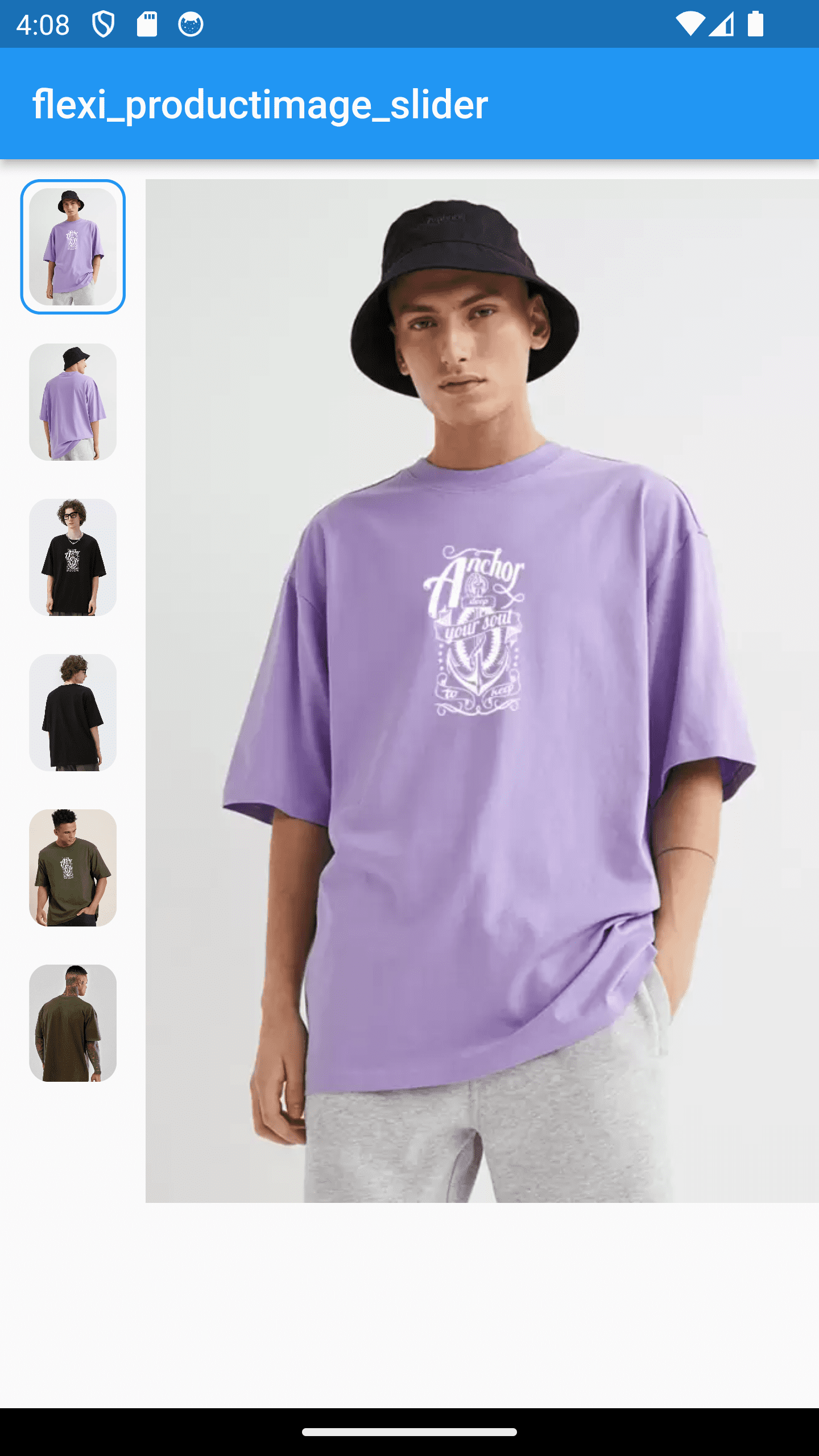
|
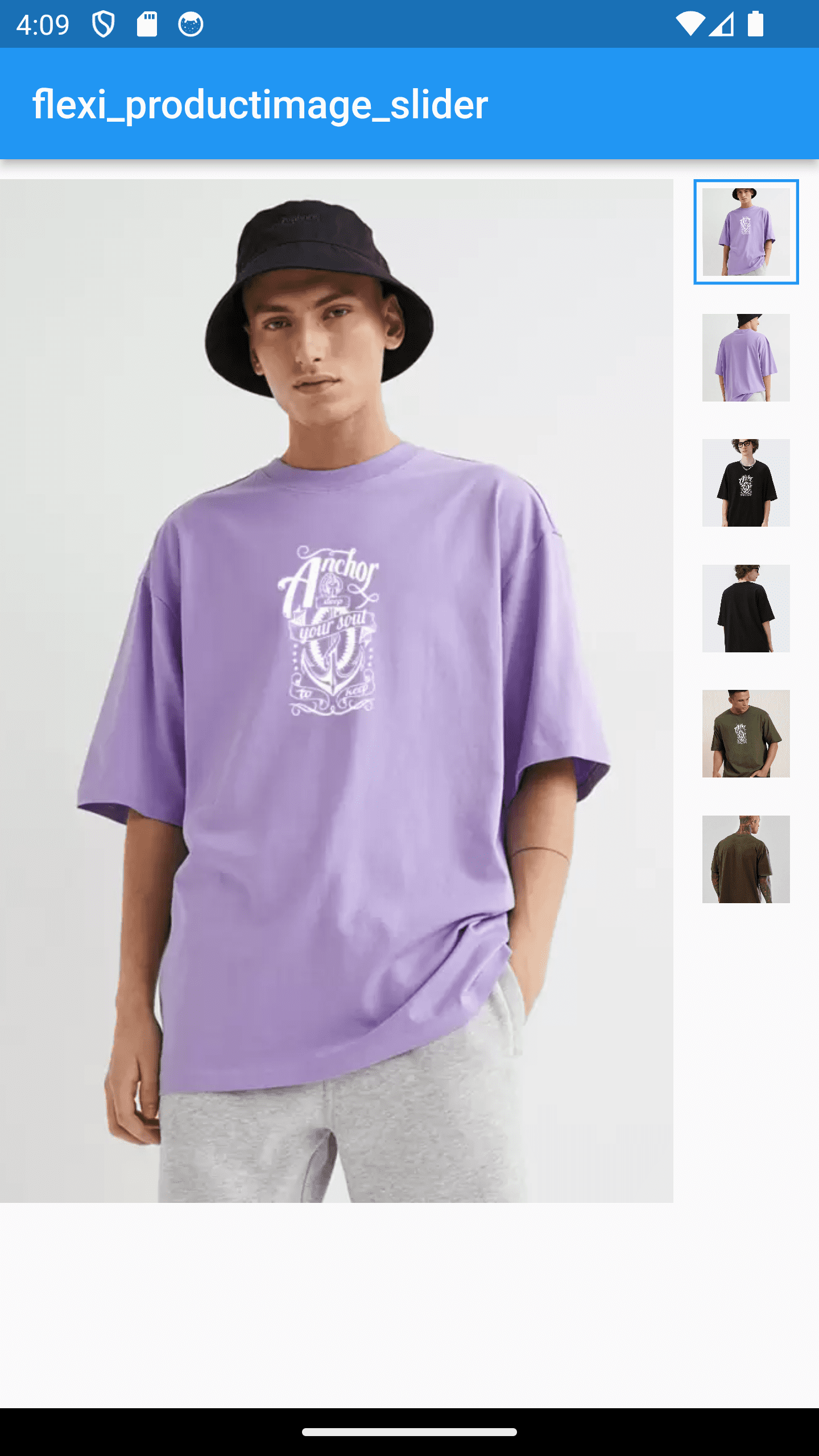
|

|

|
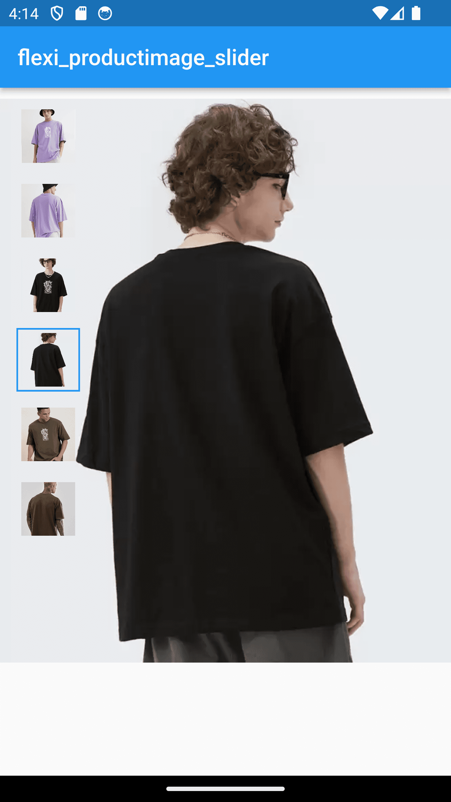
|
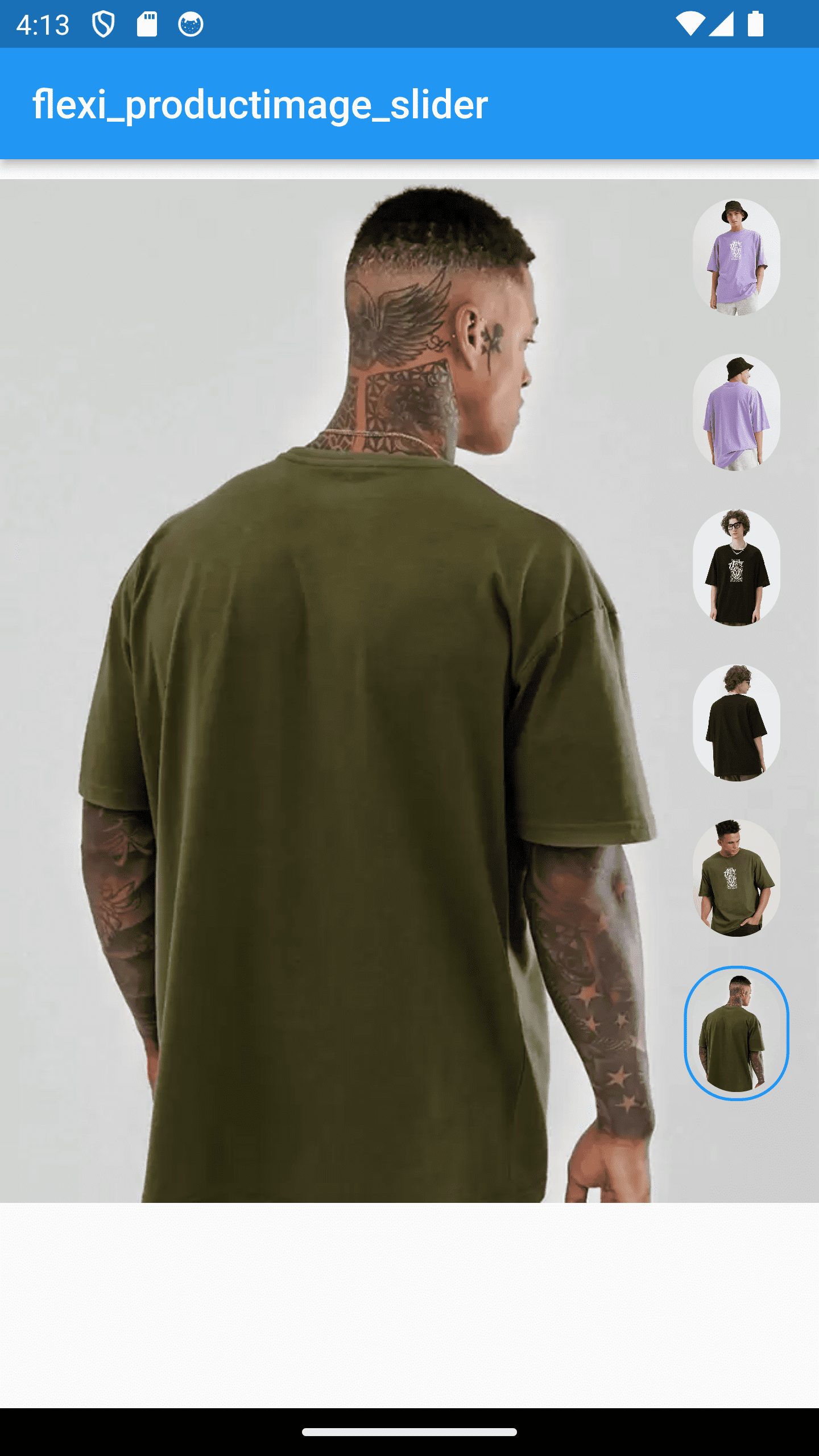
|
In your pubspec.yaml file within your Flutter Project:
dependencies:
  flexi_productimage_slider: 1.1.0
import 'package:flexi_productimage_slider/flexi_productimage_slider.dart';
flexiProductimageSlider(
//required fields
arrayImages: const [
"https://i.ibb.co/ZLFHX3F/1.png",
"https://i.ibb.co/JKJvs5S/2.png",
"https://i.ibb.co/LCzV7b3/3.png",
"https://i.ibb.co/L8JHn1L/4.png",
"https://i.ibb.co/7RWNCXH/5.png",
"https://i.ibb.co/bBsh5Pm/6.png",
],
// optional fields
//set where you want to set your thumbnail
sliderStyle: SliderStyle.nextToSlider,//.overSlider, .nextToSlider
// set you slider height like 1.0,1.5,2.0 etc...
aspectRatio: 0.8,
//set content mode of image
boxFit: BoxFit.cover,
//set this if you want to set any default image index when it loads
selectedImagePosition: 0,
//set your thumbnail alignment
thumbnailAlignment: ThumbnailAlignment.bottom,//.right , .left, .bottom
//set how selected thumbnail border displayed
thumbnailBorderType: ThumbnailBorderType.all,//.bottom, .all
//set selected thumbnail border width
thumbnailBorderWidth: 1.5,//double value
//set thumbnail corner radius
thumbnailBorderRadius: 10,
//set your thumbnail height & width
//NOTE : if you set ThumbnailShape.circle then set thumbnail width height same
thumbnailWidth: 50,
thumbnailHeight: 65,
//set color of current image thumbnail border
thumbnailBorderColor: Colors.blue,
//make you action when user click on image
onTap: (index){
print("selected index : $index");
//for zooming effect on click use gallery_zoom_slides
//https://pub.dev/packages/gallery_zoom_slides
Navigator.push(context, MaterialPageRoute(builder: (context)=>
galleryZoomSlides(
//required fields
arrayImages: arrayImages,
//Optional fields
zoomTheme: ZoomTheme.theme3,//.theme1, .theme2, .theme3
selectedImagePosition: index,
selectedThumbnailColor: Colors.blue,
)
)
);
},
),
...
NOTE : Images taken only for demo purpose