-
Notifications
You must be signed in to change notification settings - Fork 0
Extension UI Guidelines
This is an initial draft of the Extension UI Guidelines. They are designed to meet the current understood needs of purposed extensions. The Brackets team is open to any suggestions on features that may have been overlooked.
To help illustrate correct user interface implementation, design compositions have been included with a fictional CoffeeScript extension. Some guidelines rely on features not yet included in Brackets; these have been noted and serve as a projection of current plans.
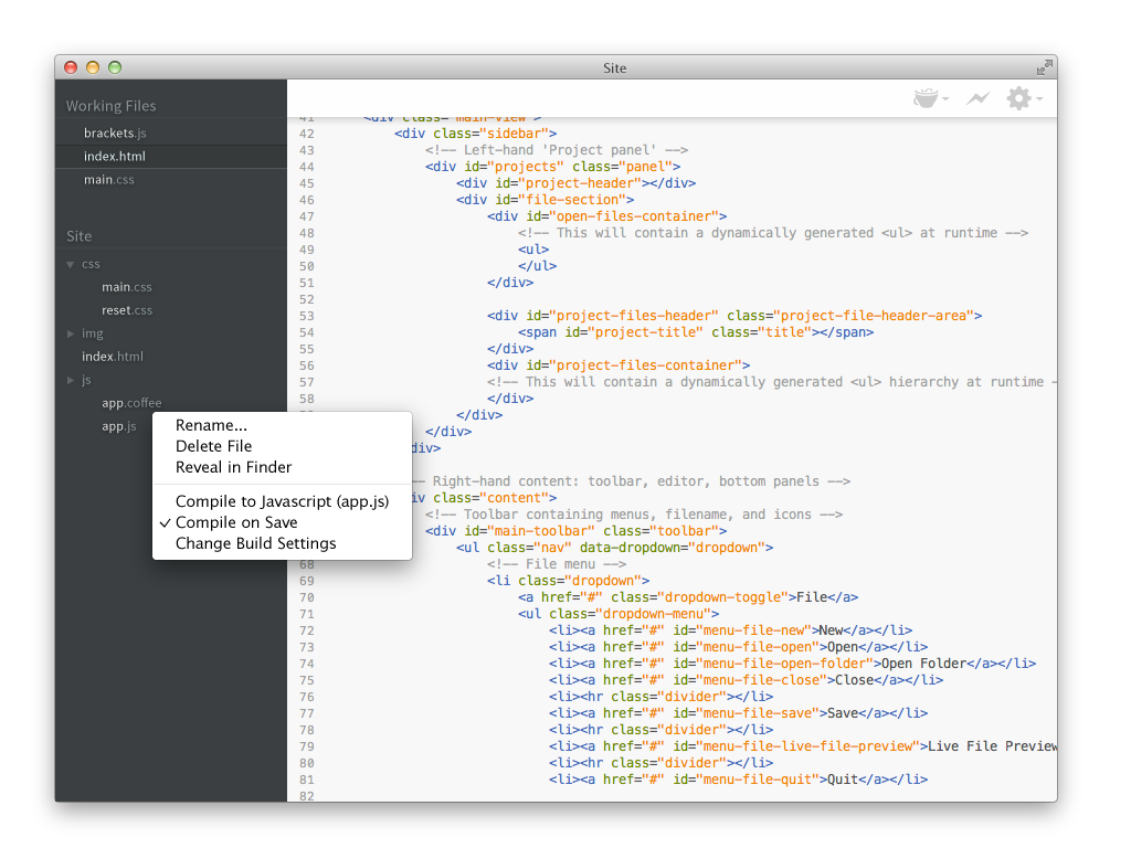
In general, our menu guidelines follow the standard UI practices for application menus.
- Avoid adding new top-level menus. Try to fit your new functionality into an existing menu. If you think it really makes sense as a new top-level menu, please discuss it on the Brackets group first.
- If you're adding more than two or three items, add a submenu instead of separate menu items. (Submenus are not yet implemented.)
- If you do add multiple items, surround them with separators. (In future, we plan to have a "menu group" API that will make this easier to manage.)
- Avoid nesting submenus further than two layers deep.
- Enable/disable menus rather than showing/hiding them. Adding or removing menu items depending on context should only be done in context menus, not in the main application menus. (However, we are considering having a way to have truly mode-specific menu items show/hide, like ones that only apply to certain kinds of files, or only when focus is in a particular kind of inline editor. The trick is to do it in a way that doesn't confuse the user's muscle memory.)

- Only show items that are relevant to the current context. Unlike application menus, you should generally show/hide items in the context menu rather than simply disabling them. However, if an item would ordinarily be applicable to the current context, but the specific selection doesn't allow it, then disable it rather than hiding it. For example, if you want to add an item to the context menu for a particular file type, but it only works for writable files and the file is read-only, then disable it rather than hiding it.
- Context menu commands should also be available from the main menu. Context menus are not always discoverable, so it's important to have an alternative entry point.
- Only put the most commonly-used functionality in the context menu. Use the main application menu for other functions.
- Use title capitalization for menu commands. Capitalize the first letter of each word, except for prepositions and conjunctions like "and," "in," or "to" (e.g., "Find in Files"). Exception: always capitalize the last word, even if it's a preposition or conjunction (e.g., "Save As...").
- Add an ellipsis to commands that require further user input to complete. In general, this applies to commands that pop up a modal dialog--e.g., "Save As...". However, commands that merely pop up informational dialogs (e.g. "About") should not have an ellipsis.
- Prefer checkmarks to changing menu item names. For example, if you have a command to show or hide a panel called Results, make the menu item be "View > Results" and check or uncheck it depending on whether it's visible, instead of making the menu item switch between "Show Results" and "Hide Results".
- Reserve simple shortcuts for common functionality. Try to avoid using simple shortcuts (Ctrl/Cmd plus a single letter) unless you're implementing something very common (on the order of Save or Find), as we will likely want to use them for core functionality in the future. Ctrl-Shift-(key) or Ctrl-Alt-(key) (which map to Cmd-Shift-(key) and Cmd-Option-(key) on Mac) are generally good choices.
- Follow platform conventions where appropriate. For most functions, just specifying a single cross-platform keyboard shortcut is good enough; Brackets will automatically map Ctrl to Cmd on Mac. However, if you're implementing a function that's traditionally had different shortcuts on Mac and Windows—for example, "Find Next" (historically F3 on Windows and Cmd-G on Mac)—make sure to specify both.
This feature is not fully implemented in Brackets.

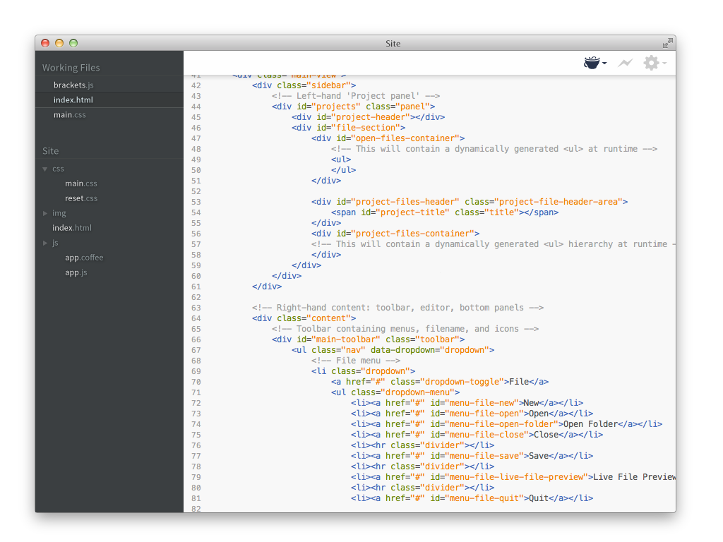
- Minimal design. The current default interface of Brackets relies on minimal design; new icons on the toolbar should be compatible with the current look and feel.
- An extension should only use a single icon. If an additional command needs to be represented in the toolbar it is recommended to use a submenu to keep the interface compact.
- Icons should have appropriate states. At a minimum, icons should have disabled, enabled, and hover states, but should also include any other states needed to indicate status to the user. See stateful indicator below.
- The toolbar is designed to be user configurable. Ensure functionality is duplicated in the application menu and anywhere else that is contextually relevant. The toolbar will be designed to be user configurable; if the icon is removed from the user's toolbar, the extension's functionality needs to be available elsewhere.
Recommended usage:
-
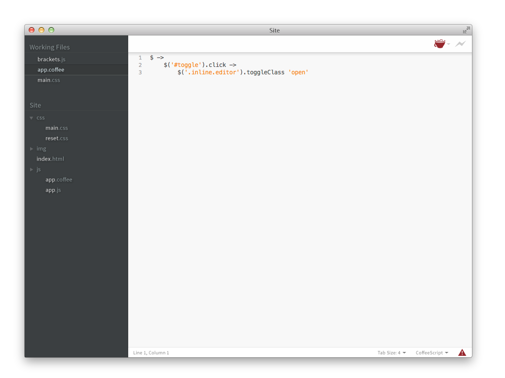
Stateful indicator. An icon on the toolbar can be used to show the current state of a behavior or command. In the example the icon indicates an error to the user.

- Quick access to commands. The icon should be interactive; clicking it should intuitively execute a command. In the above example, the user would be able to click the icon to find more information on the error.
##Panels This feature is not fully implemented in Brackets.

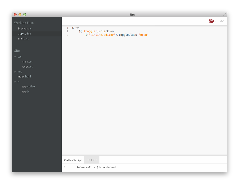
- Use wisely. In an effort to preserve an uncluttered interface, it is recommended that panels be used sparingly. Multiple stacked or nested panels can quickly distract from the code editing area.
- Panels anchored to the top should be easily hidden. For example, quick search could be anchored to the top when needed, but should hide easily when the user has finished using it.
- Other panels should be designed anchored to the left or bottom edges. The right edge should be reserved for the project panel.
##Status Bar This feature is not fully implemented in Brackets.

- Use for temporary status changes. That's why it's called a status bar.
- Duplicate functionality. The status bar may not always be visible so functionality should be duplicated in the menus and/or toolbar.
- Namespace your CSS rules. Extensions should generally not alter the styling of existing UI elements in Brackets. To avoid accidentally doing so, set a CSS class on the root element of any DOM structures you add, and make your other CSS rules contextual to that class. Also, create a reasonably unique prefix for any class names or IDs you add.
-
Be careful about modifying existing DOM structures in Brackets. Where possible, either use public Brackets APIs to build extensions or add entirely new DOM elements that you own, rather than directly modifying the existing DOM. That said, we recognize that our extensibility mechanisms are still evolving, and we want to encourage experimentation. So, if you do need to modify the DOM, here are some suggestions:
- Add DOM nodes; don't delete or move nodes created by Brackets.
- If you need to depend on a Brackets-created node, refer to one with an ID rather than relying on indices, etc.
- Be prepared to update your extension for new Brackets drops. We'll do our best to document significant changes we make to the structure of the DOM, especially nodes with IDs.
- If you find yourself having to do something fragile or gross, let us know on the brackets-dev Google Group so we can think about how to add a more formal API to help you do what you want.