-
Notifications
You must be signed in to change notification settings - Fork 169
New issue
Have a question about this project? Sign up for a free GitHub account to open an issue and contact its maintainers and the community.
By clicking “Sign up for GitHub”, you agree to our terms of service and privacy statement. We’ll occasionally send you account related emails.
Already on GitHub? Sign in to your account
add github contribute link to footer of all qunitjs.com pages #189
Conversation
|
Seems like the icon should have a different color. It also doesn't seem clear to me that this is for reporting issues about the site as opposed to the QUnit code. |
|
Hm, yeah, I agree. I just changed the color of the icon to white, but conveying the intention is either a copy or a placement change. |
|
How bout 'SITE SUGGESTIONS, PROBLEMS, FEEDBACK?' |
|
@rdworth I think that could work. It is definitely more specific I've tried another option that you can see in this screenshot: https://github.com/johnkpaul/web-base-template/compare/add_qunitjs_github_link_2 If we do this though, I need to change the content as well. The internal content pages are broken anyway for me, because the final paragraph tags don't have class "eight columns". Let me know if this is preferable and I'll update this PR. |
|
I think it's abundantly more clear when it sits in the content area. @scottgonzalez has expressed hesitation on the feasibility of that in the past. Perhaps he can weigh in. |
|
Well, it certainly doesn't belong in the raw content. There's a pre-processor available to modify content during the build step, but if it was going to be at the bottom of the content area, then it should just go in the theme anyway. I'm not really sure it belong there though; it looks a bit out of place to me. |
|
@scottgonzalez I don't mean in the raw content. I mean in the content area using the theme. I added a custom content page to themes/qunitjs.com You can see it here https://github.com/johnkpaul/web-base-template/compare/add_qunitjs_github_link_2 |
|
I took the @johnkpaul good stuff. Any idea how to make the same happen for the API site? I tried duplicating the |
|
We should really avoid adding templates like this to specific site themes. If we want consistency, we need to be implementing this kind of thing in the base theme. |
|
@jzaefferer It seems to need to be in a different place for each site and to be honest, I don't really understand why. I don't have a good idea of how the child and base themes are put together to form the final site. I agree with @scottgonzalez, because eventually, we want this on every page of every theme. I just don't know how to accomplish that generically because each site has slightly different styling/column conventions. |
|
Reverted the commit. Not sure if reopening is the right thing here. I don't know how the grid system works or where this could be added to do it consistently across all sites. |
|
I think putting it in the footer is the most reasonable place for all sites - it doesn't have to stay in the article content for learn site, it can use the area in the footer as well. We'll have to dupe it just for the 4 footers we have, but that is not a big deal. I don't think we will find a "more common" place to put it than that. I think it should probably be its own column in the footer though |
|
Ultimately discoverability is an issue if it's at the bottom of the page no matter what, whether in the footer or the bottom of the content. Would be good to find a way to get it "above the fold" per se.. we could go the "Fork on GitHub" route corner ribbon route, perhaps |
|
Any thoughts about this? I'd love to get this working in a way that is usable across all of the sites. I just don't know where it belongs from a UX/design perspective. |
|
What if we just designed something that would sit in the bottom right corner like kampyle.com? |
|
That makes sense to me. It is out of the way of the main information and can be added to every page more easily. How do we get the design process started? |
|
We're pretty light on design resources. @kleinmaetschke could you design something for this? |
|
Since I'm still fairly new to the github stuff, I have no idea how to "reference this pull request". ..here's my contribution to this need: 753f3ba |
|
@scottgonzalez @ajpiano Anyone had a moment yet to look this over? |
|
@kleinmaetschke GitHub is weird. Took me a while to figure out that that commit is in your repo, not here, as GitHub suggests. Anyway, I think this looks: Otherwise, there needs to be an actual link, and it can't use inline event handlers. I'm not sure if we can just stick |
|
@jzaefferer fwiw, regarding the validity of the |
|
Thanks Karl, that would explain my confusion. So yeah, one or more |
|
Hey @kswedberg and @jzaefferer I made a pull request with more proper code and a smaller ribbon size that shouldn't overlap with the IRC link. |
|
Few thoughts:
|
|
Closing due to inactivity. I'd really like to see us move forward with a solution for #279, but this seems to have stalled. |


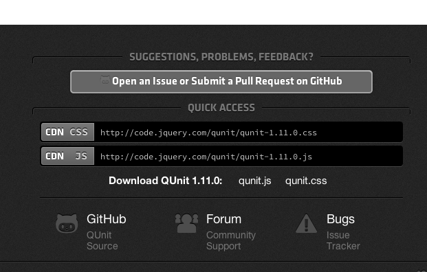
I've added the "Open an Issue or Submit a Pull Request on GitHub" button to the footer of all qunitjs pages. The footer should look like:
