You signed in with another tab or window. Reload to refresh your session.You signed out in another tab or window. Reload to refresh your session.You switched accounts on another tab or window. Reload to refresh your session.Dismiss alert
After a quick idea-storm, the GUI redesign will be pointed towards the next IOS7 release. We decided on the following:
We should prepare this release for about 1 month after the release of the current version
IOS7 GUI will be separated in different NIBs, and use code to decide whether we are loading the IOS7 nib or the IOS6.1 one.
We are going to redesign everything. I'll sum the whole idea of the theme
Removing the textured tints and add a new gradient/flat color tint for the nav bar
Removing the textured background and add ta new gadient/flat color bg
Redesigning the icons to match the new theme (nothing really complex, inverting colors and make sure the chalk texture goes away in every one of them)
Redesign the Matrix views.
Redesign the credit views.
Redesign the calculator view
Redesign the Decoder view
Redesign the resCalc view
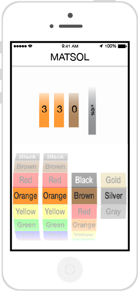
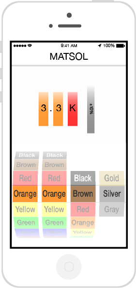
The Decoder view seems to be going to a great direction with this proposal by @aparedes:
What we know:
We need to get rid of textures and adopt a flat white/black/gray-or-anything-of-the-like theme with or without gradients.
We need to create separate xibs and resources, I can go for this if everyone wants.
We need to tweak the resistance-power function to create a distributable input between the bars, in case we go for @aparedes suggestion or something similar.
We might consider this to be Release 2.0?
The text was updated successfully, but these errors were encountered:
After a quick idea-storm, the GUI redesign will be pointed towards the next IOS7 release. We decided on the following:
We should prepare this release for about 1 month after the release of the current version
IOS7 GUI will be separated in different NIBs, and use code to decide whether we are loading the IOS7 nib or the IOS6.1 one.
We are going to redesign everything. I'll sum the whole idea of the theme
The Decoder view seems to be going to a great direction with this proposal by @aparedes:


What we know:
We need to get rid of textures and adopt a flat white/black/gray-or-anything-of-the-like theme with or without gradients.
We need to create separate xibs and resources, I can go for this if everyone wants.
We need to tweak the resistance-power function to create a distributable input between the bars, in case we go for @aparedes suggestion or something similar.
We might consider this to be Release 2.0?
The text was updated successfully, but these errors were encountered: