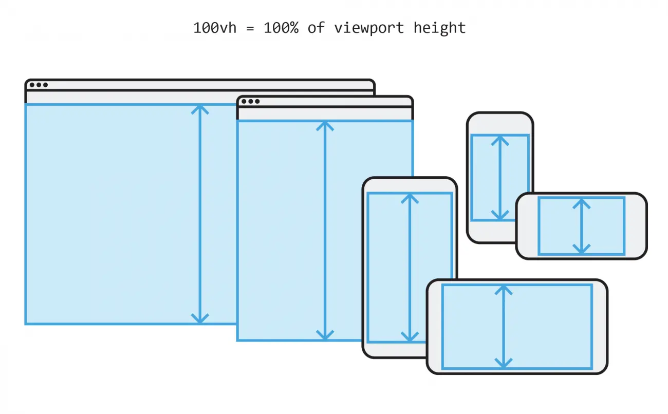
Viewport units control attributes for elements on the page based on the size of the screen whereas percentages inherit their size from the parent element.
For example, height: 100%; applied to an element is relative to the size of its parent.
In contrast, height: 100vh will be 100% of the viewport height regardless of where the element resides in the DOM.
.image {
  height: 100vh;
  width: auto;
}.shorten-me {
max-height: 90vh;
}http://codepen.io/tlattimore/details/ZpEyKL/
html {
  font-size: 16px;
}

h1 {
  font-size: calc(100% + 5vw);
}
http://codepen.io/tlattimore/full/wzwyrx/
Even thought a container has a fixed width (e.g. max-width: 1024px), 100vw allows you to break out the parent container.
.container {
  max-width: 1024px;
  margin: 0 auto;
}

.breakout {
  position: relative;
  left: 50%;
  transform: translate(-50%, 0);
  width: 100vw;
}