You signed in with another tab or window. Reload to refresh your session.You signed out in another tab or window. Reload to refresh your session.You switched accounts on another tab or window. Reload to refresh your session.Dismiss alert
As a Brain Knowledge Platform user, I want to see a summary of the electrophysiology of a cell, so that I can immediately understand at a high level the electrophysiology characteristics of the cell.
Summary:
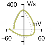
The ephys phase plot is calculable from information that comes out of IPFX. There are start and end of spike indices determined by IPFX. We could either have the phase plot just show the first spike, in which case we just pull out that waveform between the indices, calculate its time derivative, and plot the voltage (x-axis) vs the derivative of voltage (y-axis).
If we want to average spikes, we could still pull out the spikes in the same way and average them (then do the derivative & plotting) - the only slightly tricky part is getting the lengths of all the waveforms the same (but there are options for dealing with that - filling the ends of shorter ones with NaNs, etc.).
Example image and code references courtesy of NathanG:
In my plotting code, it uses an already-processed version of the AP waveform (basically a version that just takes the next 3 ms after the start of the spike).
Track the output image in LIMS.
size?
layout?
labels?
background/transparency?
Tasks:
asdf
Acceptance criteria:
asdf
The text was updated successfully, but these errors were encountered:
As a Brain Knowledge Platform user, I want to see a summary of the electrophysiology of a cell, so that I can immediately understand at a high level the electrophysiology characteristics of the cell.
Summary:
The ephys phase plot is calculable from information that comes out of IPFX. There are start and end of spike indices determined by IPFX. We could either have the phase plot just show the first spike, in which case we just pull out that waveform between the indices, calculate its time derivative, and plot the voltage (x-axis) vs the derivative of voltage (y-axis).
If we want to average spikes, we could still pull out the spikes in the same way and average them (then do the derivative & plotting) - the only slightly tricky part is getting the lengths of all the waveforms the same (but there are options for dealing with that - filling the ends of shorter ones with NaNs, etc.).
Example image and code references courtesy of NathanG:

The function that plots it is here:
https://github.com/AllenInstitute/mouse-met-figures/blob/408585d3769e99252aef4ef0ac074517dc5fa9b7/mouse_met_figs/summary_fig.py#L294
And that function is called around here:
https://github.com/AllenInstitute/mouse-met-figures/blob/408585d3769e99252aef4ef0ac074517dc5fa9b7/mouse_met_figs/summary_fig.py#L524
In my plotting code, it uses an already-processed version of the AP waveform (basically a version that just takes the next 3 ms after the start of the spike).
Track the output image in LIMS.
size?
layout?
labels?
background/transparency?
Tasks:
Acceptance criteria:
The text was updated successfully, but these errors were encountered: